Case Study: Top Brands' Twitter Background Design Fails
/In a recent blog post, I offered my new Twitter background template as a free download so that you can easily optimise your profile's design to be viewed as intended on whichever screen resolution a desktop viewer is using. That got me wondering... with teams dedicated to design and social media management, how do the Twitter background designs of some of the world's biggest companies fare?
Across a random sample, I screen grabbed the 1920 x 1200 (the biggest screen resolution at which people are likely to view a Twitter profile) and 1366 x 768 (currently the most common screen resolution, according to global statistics). The results were pretty surprising...
The Bad
Where the companies I came across had attempted specific Twitter branding on both sides of the news feed, i.e. not just a single-image background), lots of the designs had not been optimised for viewers on different resolutions. Here are a few examples:
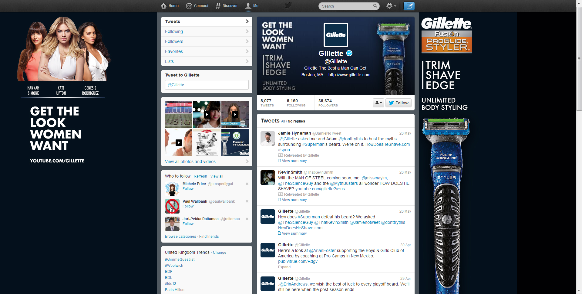
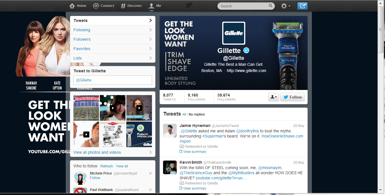
Here's the Twitter page for Gillette. At 1920 x 1200 pixels, the design looks great but for the big black bar on the right-hand side which reveals that the navy gradient hasn't been made big enough to accommodate for large displays. And at 1366 x 768 pixels, the "Get the Look Women Want" branding is hidden behind the feed, while the image on the right-hand side of the feed completely disappears!
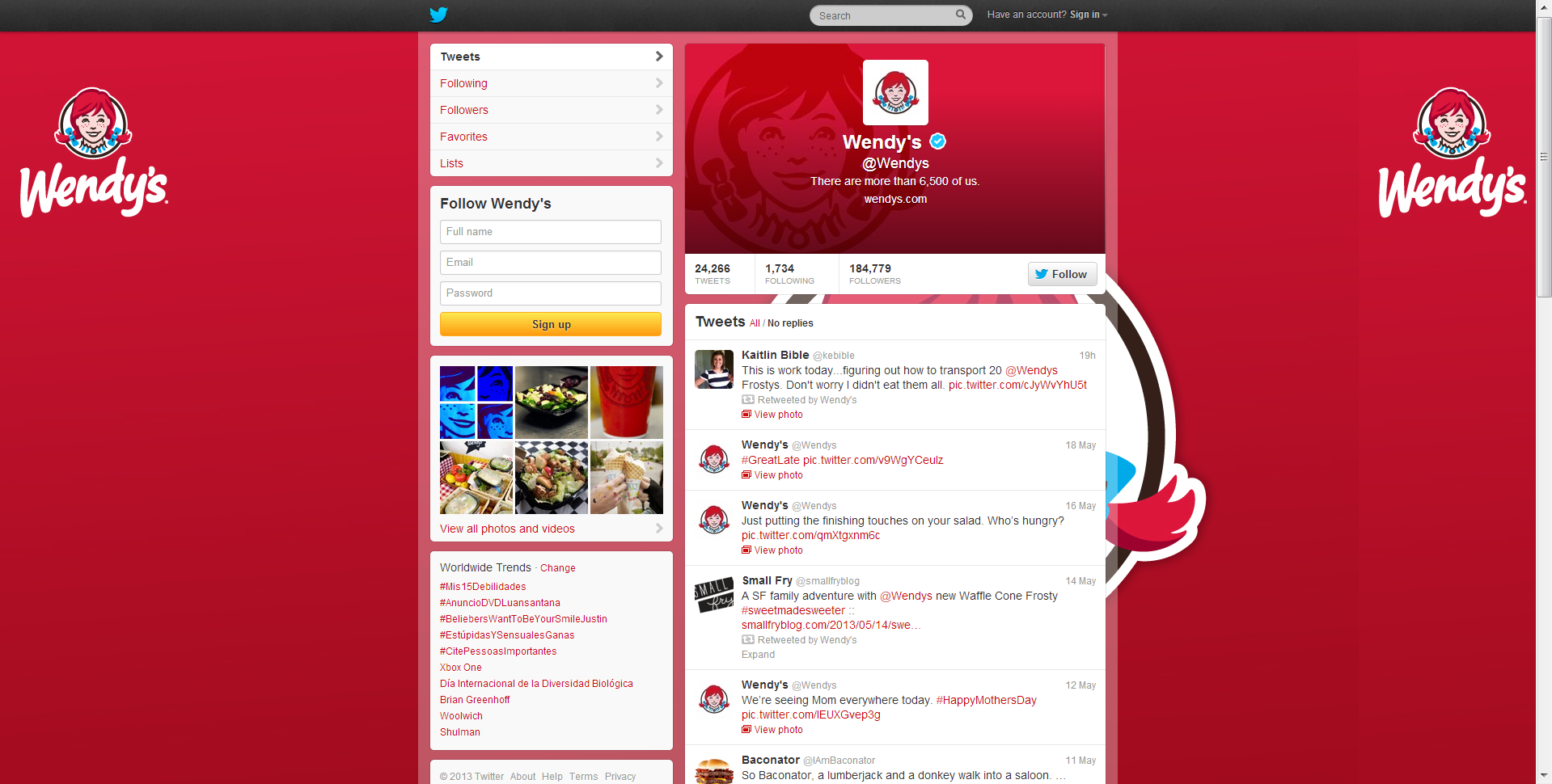
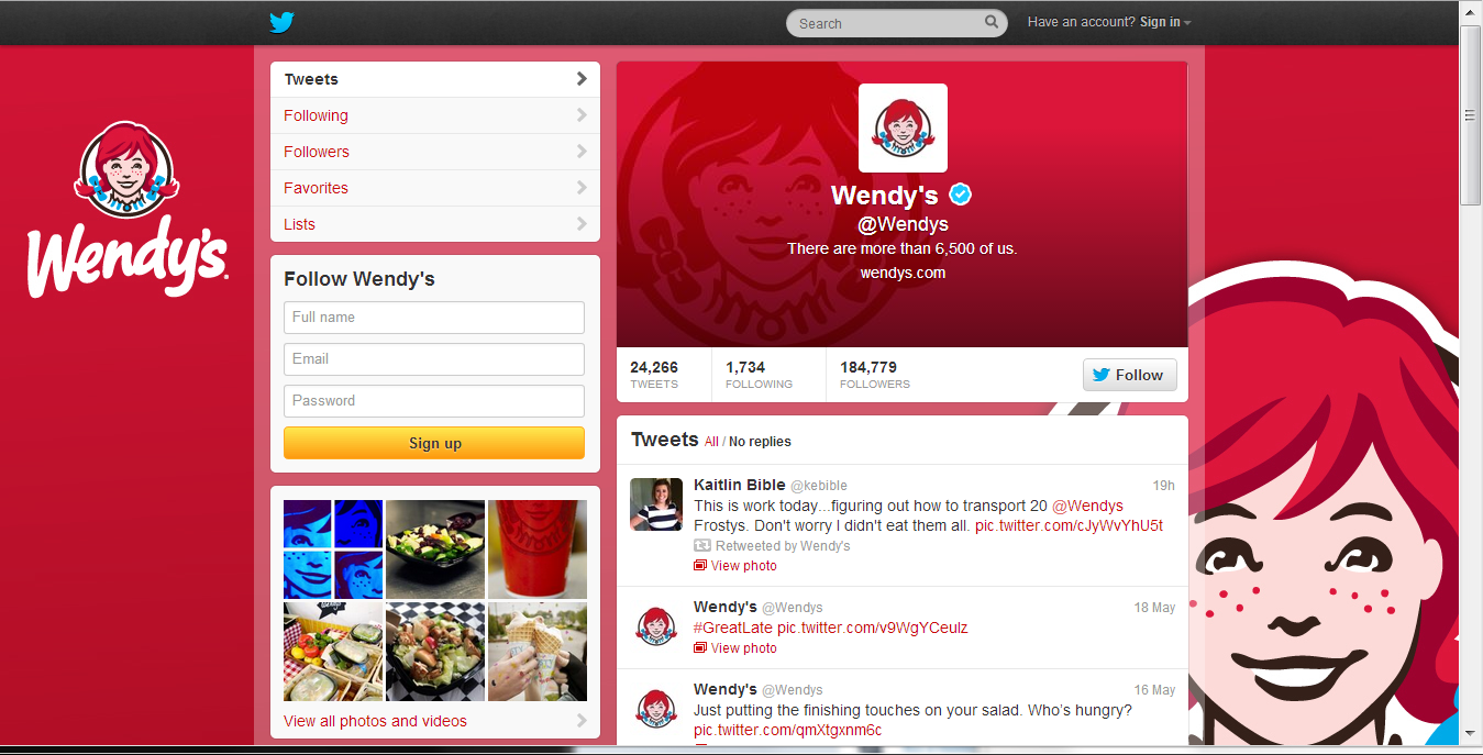
Last up, here's fast food company, Wendy's, who get things half-right. At high resolution, its left-hand side Twitter branding is fine, but a second large image is obscured by the news feed. At 1366 x 768 pixels, the design looks as it was probably intended to.
The Good
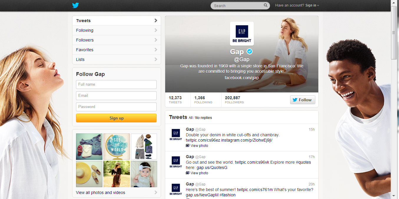
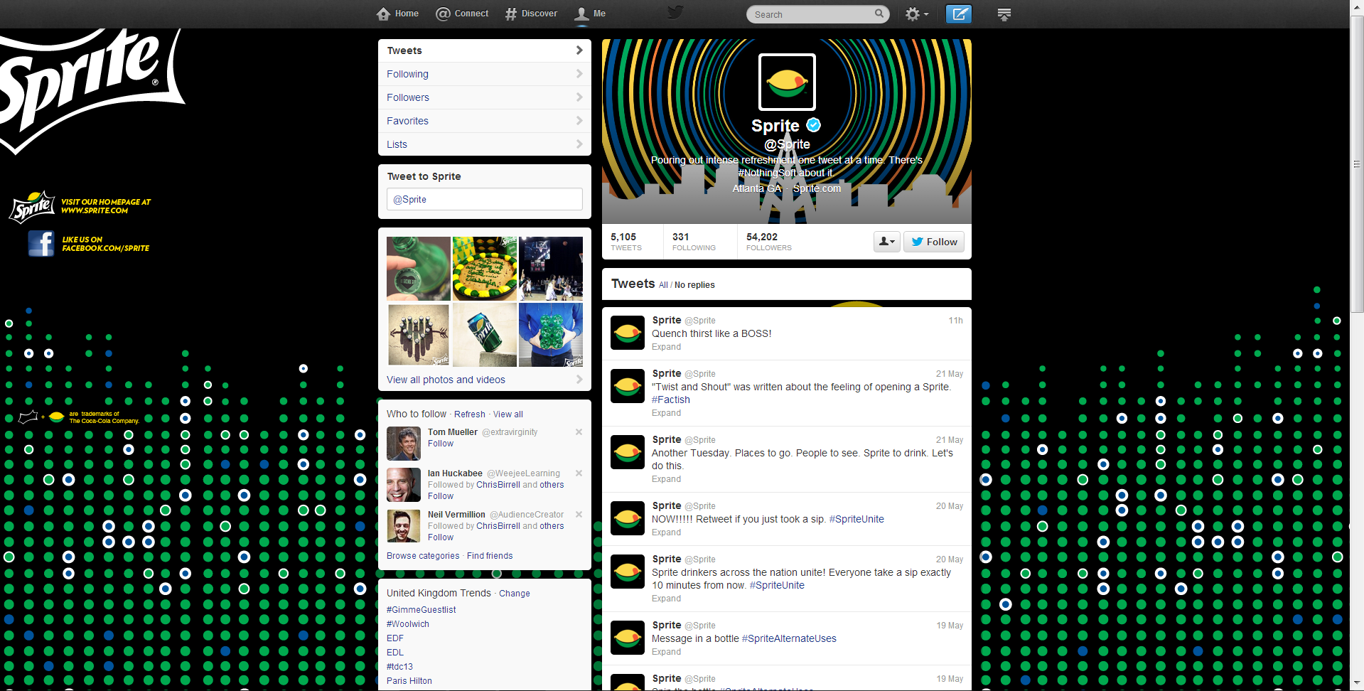
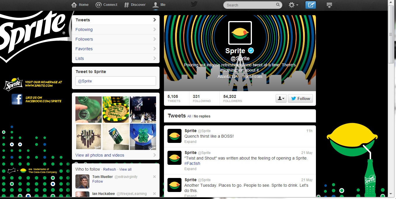
It was surprisingly difficult to find good examples of optimised Twitter backgrounds from the hour or so I spent looking at the feeds of big brands, so props go to Gap and Sprite (kinda) for these examples!
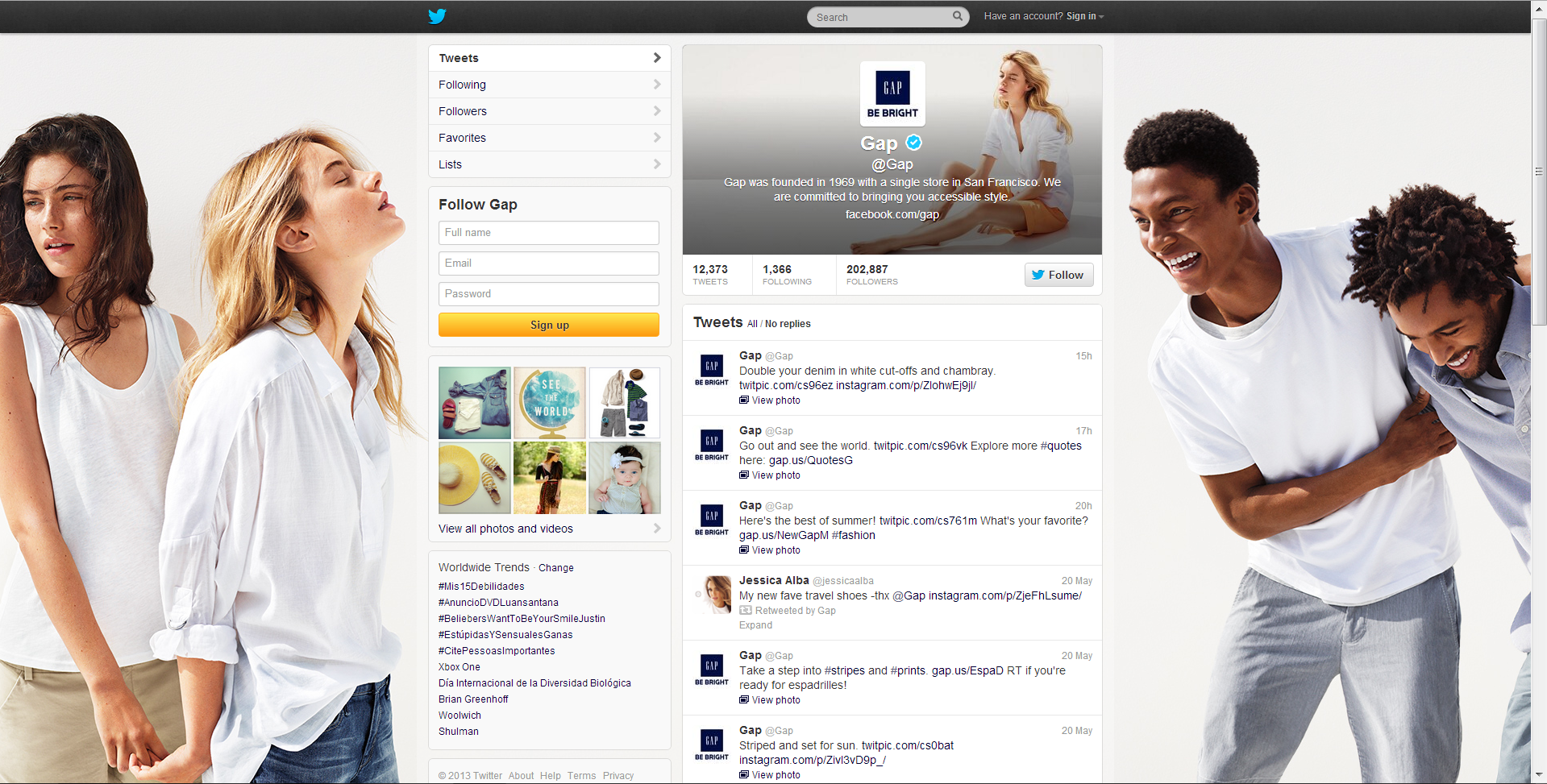
Gap's Twitter background works at both the biggest resolution, and at the most commonly viewed resolution. While one person is chopped off either side in the reduced view, the design still looks great.
Finally, here's Sprite. Okay , the logo is chopped off the side in both examples, and the lemon-sipping-a-drink graphic is missing in the high resolution review, but both designs still mostly work!
Conclusion
From my terribly unscientific experiment, it seems that a significant proportion of big brands, while keen on branding their Twitter accounts, have not done so in a way that takes into account all of the different resolutions that people will be viewing their pages at on desktop computers, resulting in branding that is unusually slack for such big commercial voices.
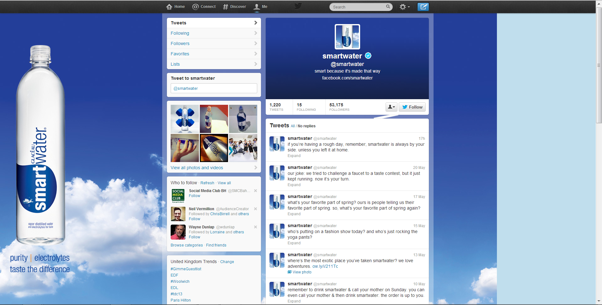
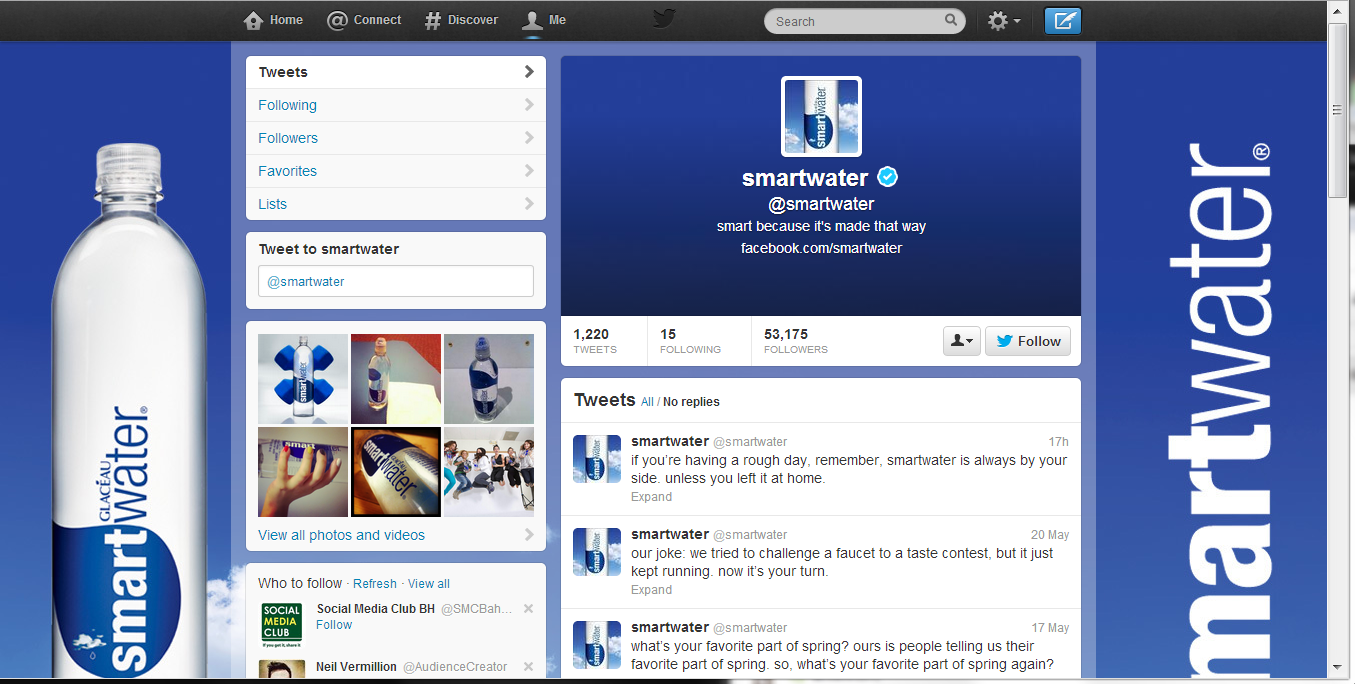
If you want to stay one step ahead of Gillette, SmartWater, Wendy's, and many others with an optimised Twitter background design, have a read of my Twitter background Template blog post and grab a link to download the template there too.
ABOUT THE AUTHOR
Buy 500 Social Media Marketing Tips (Kindle or Paperback)
Amazon US: http://www.amazon.com/dp/B007L50HE6
Amazon UK: http://www.amazon.co.uk/dp/B007L50HE6
Follow Me:
http://www.facebook.com/500socialmediatips/
https://pinterest.com/500socialmedia/
http://www.twitter.com/500socialmedia
http://www.youtube.com/500socialmediatips


