Facebook Contest Strategy - Custom Tab Images for Sweepstakes
/Holding competitions and sweepstakes on Facebook is one of the most popular ways for brands to increase likes and attract potential new customers with relative ease and expense. I recently launched my first Facebook contest, with a prize of 5 paperback copies of 500 Social Media Marketing Tips.
As per Facebook's contest rules, I used an exernal app, Woobox, to help manage entries and choose a winner. Woobox installs a custom tab on your Facebook page to host the contest, and allows you to create a custom tab image to represent it. It's these 111 x 74 pixel images that I want to discuss in this blog post. I'll show real examples of what I consider to be bad and good examples, and how the latter can help boost the visibility of your contest and heighten the number of entries you receive.
Disclaimer: I am aware that there are plenty of ways to drive people to a contest tab via external links, but I am focusing solely on visits to the Facebook page itself.
The Bad - Buyagift
Buyagift's contest gives fans the chance to win a romantic meal for two as part of a Valentine's Day promotion, but visitors to the page would hardly know it! First of all, the contest tab is hidden "below the fold" of the four tabs that appear by default on all Facebook pages, meaning that users must go exploring to even find it.
Secondly, the custom tab image itself does reflect connotations of love and Valentine's Day with its pink colour, hearts, and wispy font, but no one will know what the prize is without clicking - and most people probably won't even do that to find out. Lastly, the text underneath the custom tab is poor. "Valentine's" doesn't really compel anyone to click on the tab to find out more - this is a perfect place to add a call to action or other powerful message.
The Good - Lowcostholdidays
In this example, lowcostholidays has done a great job of publicising its contest to over 100,000 fans and every potential new one who visits their Facebook page. First off, the contest tab is placed prominently "above the fold" where everybody can see it. Second, the custom tab image not only tells people what they can win, but the prize is with a very tempting image of a sunny vacation destination, in keeping with the visual branding style on the rest of their page too. Lastly, the custom tab text is a call to action telling users what they have to do to - "Take Our Quiz" - to enter.
The Mine - 500 Social Media Marketing Tips
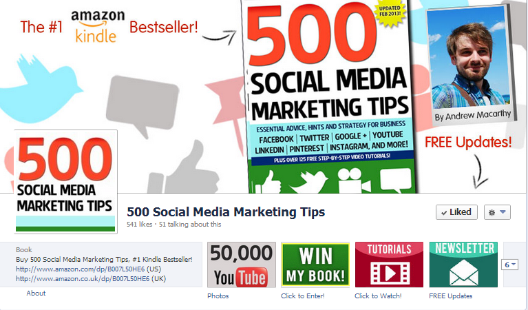
Here's the custom tab image I designed for my competition. Unlike lowcostholidays, I have decided to give the whole tab image over to the text 'WIN MY BOOK!', as my page is all about one product - rather than the innumerate number of vacations that lowcostholidays sells - and there is a huge photo of the book in the page's cover image.
I used contrasting colours of white, green, and yellow to help the tab stand out on the page, but still keep it in line with the page's visual branding. And lastly, my call to action reads "Click to Enter!", a clear direction to anybody who sees it. I would have liked the arguably more clear "Click Here to Enter!" but that won't fit without being cut off and damaging the call to action altogether.
Conclusion
While many brands will rely on non-Facebook sources to help drive users direct to their contest apps, there is certainly something to be said for giving the promotion the best chance of succeeding as possible - and this includes using a great custom tab to market the event direct on your Facebook page.
ABOUT THE AUTHOR
Andrew Macarthy is the author of the #1 Amazon Kindle Bestseller, 500 Social Media Marketing Tips.
Buy 500 Social Media Marketing Tips
Amazon US: http://www.amazon.com/dp/B007L50HE6
Amazon UK: http://www.amazon.co.uk/dp/B007L50HE6
Follow Me:
http://www.facebook.com/500socialmediatips/
https://pinterest.com/500socialmedia/
http://www.twitter.com/500socialmedia/


