5 Ways to Use YouTube Annotations Like A Pro | Use YouTube Annotations Effectively

 
​5 Ways to Use YouTube Annotations Like A Pro #youtube #socialmedia

​5 Ways to Use YouTube Annotations Like A Pro #youtube #socialmedia

YouTube Annotations can be a great way improve your video content on the site, whether that be to add an extra layer of detail, to entertain, or to add a clickable call to action. Not all annotations, however, are created equal. Here are five ways to optimise the use of yours, in a way that will enhance your viewers' enjoyment of your videos, instead of turning them away. 

Note: The annotation examples below are demonstrated on top of some of my 'home video' content, but the principles easily apply to business and marketing content.

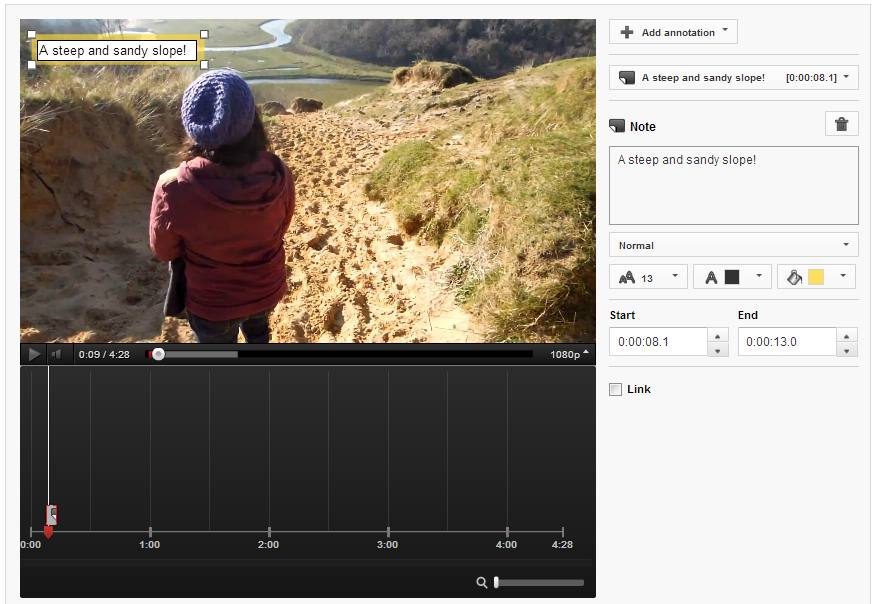
1. Annotation Duration

youtube-annotation-duration.PNG

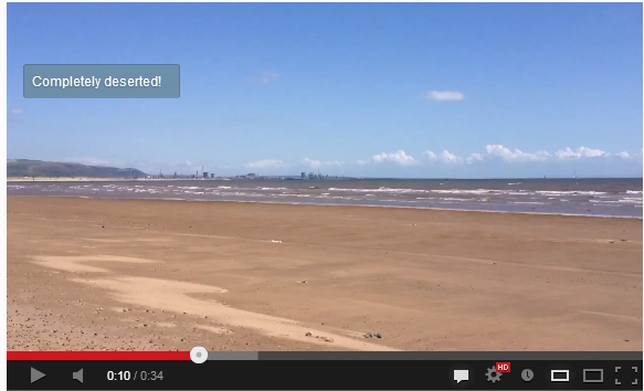
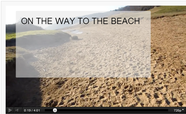
Annotations can be displayed on top of a video for as long a time as you choose, and while they can be manually closed by the viewer, you don't want to have to make them resort to this as it will disrupt their viewing experience. Therefore, aim to have your annotations appear onscreen for only as long as it takes to read them. In most cases, this will be no longer than 5-7 seconds.

2. Annotation Size

youtube-annotations-size.PNG

By dragging the edges of your annotation in the editor, you can make them as big or as small as you like. Just because you can make an annotation cover the whole of the screen, however, doesn't mean you should! While you'll want it to be seen, the mere action of it popping up onscreen is enough for the majority of people to notice it. Try to keep your annotations as small and unobtrusive as possible, and also refrain from typing their content in ALL CAPS, as this approach can be considered rude and "shouty" online.

3. Annotation Colour

youtube-annotation-color.PNG

YouTube allows you to set the background and text colour of your annotations, but unless the content of the message is absolutely critical to the video (like explaining a detail you forgot to include during recording), their hues are best left subtle. Bright colours like red, yellow, and green are attention-grabbing, but pale and transparent colours are much classier and are much less likely to spoil a viewer's enjoyment of your video. In short, annotations do not always have to take centre stage.

4. Annotation Placement

youtube-annotation-placement.PNG

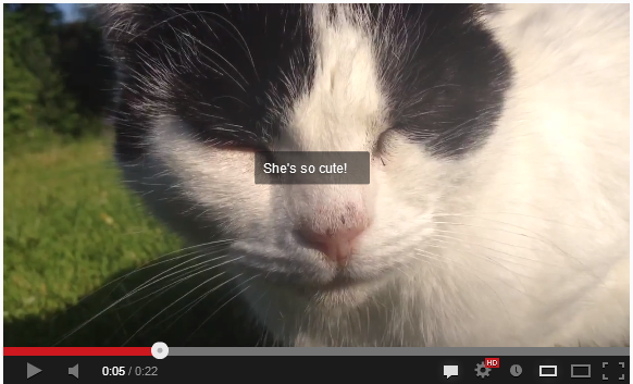
As in some of the points above, annotation placement is all about them being as unobtrusive as possible - not like the example above, which completely ruins a cute shot of Jenny the cat! The best placement for annotations is at the left and right sides of the video, near the top of the bottom. Avoid placing annotations in the lower third of the video, as there is a chance that they will be obscured by overlay adverts. 

5. Annotation Numbers

youtube-annotations-number.PNG

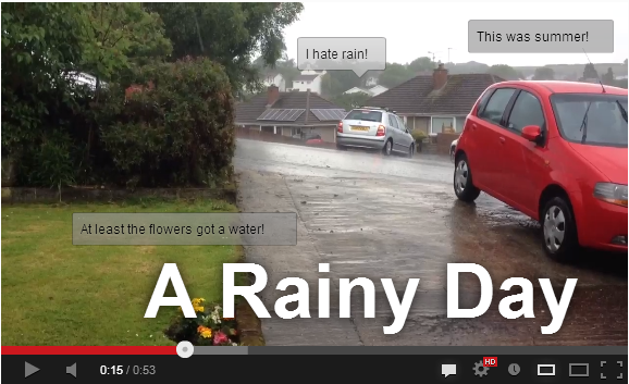
In short, the fewer annotations your video needs, the better. If your video ends up looking like the example above, it is bound to be a turn-off for your viewers - displaying multiple annotations at once can be distracting and confusing. There's one exception to this rule, however, and it's one I employ on the "end screen" of my videos. Here, I give viewers to either click a Subscribe button, or to click through to my previous video. 

Conclusion And Over to You

So there you have it, five simple tips for YouTube annotations that won't only enhance your videos, but also ensure that the viewing pleasure of your audience is kept at as high a level as possible. Do you have any other tactics for the optimum use of annotations? Let me know in the comments below! 


ABOUT THE AUTHOR

Andrew Macarthy is the author of the #1 Amazon Bestseller, 500 Social Media Marketing Tips.

Buy 500 Social Media Marketing Tips (Kindle or Paperback)
Amazon US: http://www.amazon.com/dp/B007L50HE6
Amazon UK: http://www.amazon.co.uk/dp/B007L50HE6

Follow Me:
http://www.facebook.com/500socialmediatips/
https://pinterest.com/500socialmedia/
http://www.twitter.com/500socialmedia
http://www.youtube.com/500socialmediatips

Facebook Cover Photo Template PSD 2013 | Facebook Cover Image Template Photoshop

I don't know what it is about finding an easy-to-use Facebook cover photo template online, but none of the ones I was finding in Google's most popular search results were hitting the spot for me. So here's my offering; a super simple PSD template to help you design an image that will perfectly represent your brand on the site - no blurry photos or dubious cropping in sight.

Want me to design and build your social media layouts?

Even with the templates below, I understand that designing and building great social media branding can be tricky, especially if you have never used Photoshop or don't have the time to do the work due to a busy schedule... that's where I can help!

If you'd like me to create your social media branding for Facebook, Twitter, YouTube, and more, please get in touch via the Contact Me page today with your requirements, and I'll get back to you shortly afterwards. 

facebook-cover-photo-template.jpg

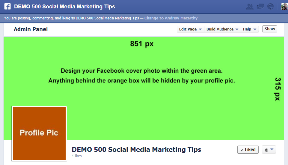
Facebook cover images are 851 pixels wide and 315 pixels tall. The template's green layer is this size. Just work above it in a new layer and delete the green rectangle when you are finished. Beware, however, of the orange square. Facebook profile photos noticeably iminge on the 851 x 315 px rectangle, so you'll have to work around it and make sure nothing too crucial image-wise is sitting behind it. 

facebook-cover-image-photo-template-psd.PNG

When you're all done desiging, delete every layer except your new cover design, then save it as a .png or .jpg file to upload to Facebook.  As you can see from the example above, the green cover photo rectangle fits perfectly, and the Profile Pic square is hidden behind the actual (overlaid) profile photo square.

minus-dl.jpg

Download the Facebook Cover Photo Template


This Facebook cover photo template (and several others for all the biggest social networks - expertly measured, simple to use, and up-to-date) is available instantly as a downloadable zip file via the purchase link above. For more information on all my social media templates, click here.

Note: Payment is fast and secure via PayPal, but you do not need a PayPal account to buy and download. 

Alternatively, buy a copy of my #1 Web Marketing Bestselling book500 Social Media Marketing Tips,  on Kindle or in paperback, and receive a link to download them all for free - you'll find it located in the Social Media Templates chapter. 


ABOUT THE AUTHOR

Andrew Macarthy is the author of the #1 Amazon Kindle Bestseller, 500 Social Media Marketing Tips.

Buy 500 Social Media Marketing Tips
Amazon US: http://www.amazon.com/dp/B007L50HE6
Amazon UK: http://www.amazon.co.uk/dp/B007L50HE6

Follow Me:
http://www.facebook.com/500socialmediatips/
https://pinterest.com/500socialmedia/
http://www.twitter.com/500socialmedia
http://www.youtube.com/500socialmediatips
How to Change Pinterest Board Covers (And Why You Should!)

 
how-to-change-pinterest-board-covers.jpg

Changing your Pinterest board covers is one of the most simple optimisation tricks for your Pinterest profile, but is something that a lot of brands neglect to do. 

In this video, I show you how easy it is to change your Pinterest Boards, and explain why doing so is so important to keep your profile fresh and attract as many viewers as possible to click on your content. 


ABOUT THE AUTHOR

Andrew Macarthy is the author of the #1 Amazon Kindle Bestseller, 500 Social Media Marketing Tips.

Buy 500 Social Media Marketing Tips
Amazon US: http://www.amazon.com/dp/B007L50HE6
Amazon UK: http://www.amazon.co.uk/dp/B007L50HE6

Follow Me:
http://www.facebook.com/500socialmediatips/
https://pinterest.com/500socialmedia/
http://www.twitter.com/500socialmedia
http://www.youtube.com/500socialmediatips
 

How to Promote Facebook Page on Personal Profile (April 2013)


One of the easiest ways to give your Facebook Page a small boost in exposure is to include it as your place of work on your personal Facebook profile. I created a tutorial to show how to do this a long while back, but some people were not able to make it work for them. 

The issue seemed to be affecting Page owners with few likes, or a Page name that was very common. I explain a little about all of this and how to work around the problem in the video above. 


ABOUT THE AUTHOR

Andrew Macarthy is the author of the #1 Amazon Kindle Bestseller, 500 Social Media Marketing Tips.

Buy 500 Social Media Marketing Tips
Amazon US: http://www.amazon.com/dp/B007L50HE6
Amazon UK: http://www.amazon.co.uk/dp/B007L50HE6

Follow Me:
http://www.facebook.com/500socialmediatips/
https://pinterest.com/500socialmedia/
http://www.twitter.com/500socialmedia
http://www.youtube.com/500socialmediatips
How to Target Page Fans ONLY in Facebook Promoted Posts (Not Friends of Fans Too)

 
how-to-target-fans-only-facebook-promoted-posts-not-friends-of-fans.jpg

Facebook Promoted Posts provide a quick and easy way for Page owners to get their content in front of the eyes of more of their fans than the site's EdgeRank algorithm might naturally allow, but a recent change to the function has removed the option to promote your content to fans only , replacing it with a default option that forces you to promote your post to fans and  their friends.

In terms of marketing to the most relevant users, you might want to keep your promoted posts going to fans only, but now can't. Luckily, there is a way around this, by making a few quick changes in the Facebook Ads manager. I show you how in the above video.


ABOUT THE AUTHOR

Andrew Macarthy is the author of the #1 Amazon Kindle Bestseller, 500 Social Media Marketing Tips.

Buy 500 Social Media Marketing Tips
Amazon US: http://www.amazon.com/dp/B007L50HE6
Amazon UK: http://www.amazon.co.uk/dp/B007L50HE6

Follow Me:
http://www.facebook.com/500socialmediatips/
https://pinterest.com/500socialmedia/
http://www.twitter.com/500socialmedia
http://www.youtube.com/500socialmediatips