A Top YouTube Channel Trailer Tip: Use Shortened URLs

 
how-to-get-more-youtube-channel-engagement.jpg

One of my most popular video tutorials is about how to make a great YouTube ​channel trailer. A point I neglected to make in it, though, is how you can use shortened links to make the channel trailer video's description as enticing and clickable as possible. 

The old description (and three reasons why I didn't like it)​

​This is how my YouTube channel trailer and its description looked before. If you take a close look, you'll see that several of the links to my social media profiles - which I obviously want users to click on - are not visible in their entirety. This small detail bothered me for three reasons: 

1. It just looks a little messy.​
2. The links cannot be glanced at and memorised, even if they aren't clicked on immediately.
3. Any clicks on these links - visible front and centre on my YouTube profile - cannot be tracked easily, and I cannot measure their effectiveness over time.

The new description (and why I like it much better)​

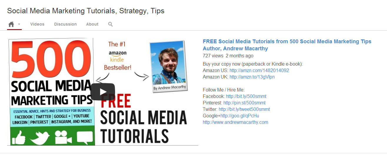
youtube-trailer-about-section-after.PNG

I my updated YouTube channel trailer description recently, and there are a couple of main differences:​

1. The links are all shortened, look much neater, and are visible in their entirety.​
2. Several of the shortened links are customised with my own branding to make them much more memorable.
3.  All of the shortened links can be tracked via the sites on which they were created.

The URL Shorteners I used

I used several different URL shortening sites in my description, including:

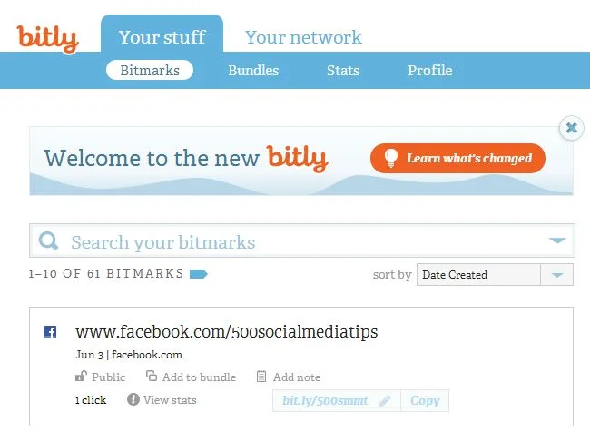
bit.ly: My preferred choice, which adds the shortened Amazon ("amzn") text to products on the site, and allows link tracking - sign up required for URL customisation.

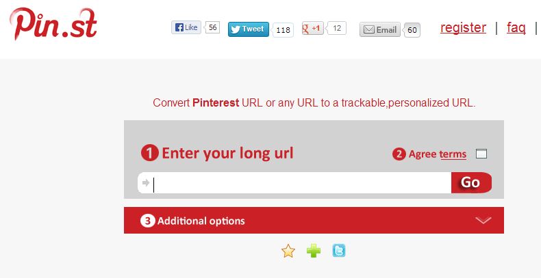
pin.st: Mirrors Pinterest site name and allows tracking - sign up required for URLcustomisation.  

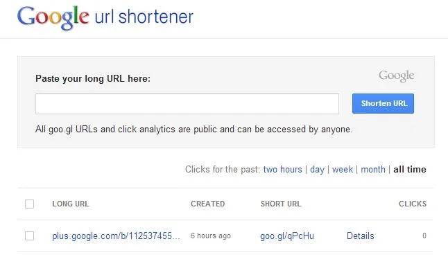
goo.gl: Google's own URL shortener, includes publicly visible tracking but no customisation option at present.

Conclusion

Neatening up your YouTube channel trailer description and links is only a small detail, but I guess these little things are the elements that add up to make the big impacts :) ​


ABOUT THE AUTHOR

Andrew Macarthy is the author of the #1 Amazon Web Marketing Bestseller, 500 Social Media Marketing Tips, available for Kindle and in paperback.

Buy 500 Social Media Marketing Tips
Amazon US: http://www.amazon.com/dp/B007L50HE6
Amazon UK: http://www.amazon.co.uk/dp/B007L50HE6

Follow Me:
http://www.facebook.com/500socialmediatips/
https://pinterest.com/500socialmedia/
http://www.twitter.com/500socialmedia
http://www.youtube.com/500socialmediatips

portrait-blog.jpg

5 Things You Must Do to Prepare For the New YouTube One Channel Layout 2013

new-youtube-one-channel-layout.jpg

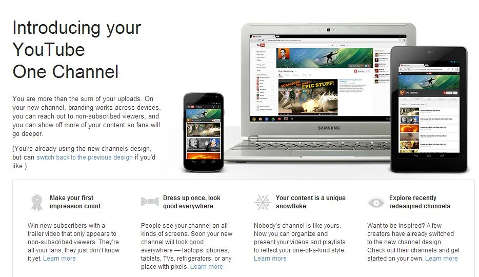
The new YouTube One Channel layout has been available for a month or two now, but only on an opt in basis. Over 100 million users have already made the switch, but from June 5th, all channels will be automatically and permanently moved to the new design, whether they're ready for it or not! The last thing you want is for your channel and its branding to look out of sorts when the switch happens, so here are 5 Things You Must Do to Prepare For the YouTube One Channel Layout. These simple steps to get yourself ready ahead of time and take advantage of the benefits of the new layout as soon as possible.

1. Opt In Now

opt-in.JPG

To be ready before the automatic switchover (and make use of the next four pointers), opt in to the YouTube One Channel layout now by visiting http://www.youtube.com/onechannel. Have a read through the overview provided if you wish, bid farewell to your old channel layout one last time, then hit the button at the bottom of the page to upgrade.

2. Upload A Channel Icon

500socialmedia-1354822281_600.jpg

Once you're upgraded, upload a square, high-resolution (800px x 800px) image for your channel icon; a pic that is also recognisable at smaller resolutions. This image will be your channel’s icon all over YouTube - in search results, comments, and on your Channel Art (explained next).

3. Upload Channel Art

youtube-channel-art-example.JPG

The One Channel design ditches the background branding of old and opts instead for a simple cover image known as your Channel Art. Your YouTube channel's icon sits on top of it, and you can also add clickable icons to your website and social media profiles. To get started, hover over your channel art place holder and click the pencil icon that appears in the top-right corner. In the drop-down menu, click "Edit Channel Art" and "Edit Links" respectively.

The most effective YouTube Channel Art is an image that is optimised to display well on whichever resolution it is being viewed. To ensure yours looks great on screens from mobiles to HD televisions, use the guidelines in my template, which you can download here: Social Media Templates Page

4. Create A Channel Trailer


The new YouTube channel pages have two primary ways of displaying video content in the Home tab: through the Browse view or through the Activity Feed. The Activity Feed broadcasts your activity on YouTube to your subscribers, while the Browse view two different "sub-views": a view for subscribers, and a view for viewers who have not yet subscribed to your channel. For this reason, the Browse view is my preferred default, but it needs to be enabled first. Here's how:

1. Hover your cursor over the menu bar that contains the 'Video', 'About', and 'Discussion' tabs on your Channel Page.

2. Click on the pencil icon that appears to open the Channel Navigation menu.

3. From here, click the button to enable the Browse feed, and then click Save. Go back to your Channel page and you'll be able to add a trailer over a place holder.

For instructions about how to create a great channel trailer to entice in new subscribers, watch my tutorial video above. 

5. Add Sections

sections.JPG

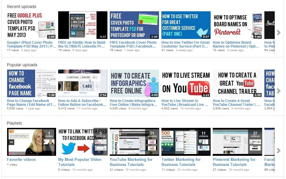
Sections are a way for you to organise your videos into groups on your channel page, and they can either be built manually or created dynamically from video tags, likes, etc. Use sections to highlight your best content, both to subscribed and non-subscribed viewers. To begin, scroll to the bottom of your channel page and click the "Add a section" button.

Conclusion

So there you have it, a handful of simple and effective ways you can help make your brand's transition to the YouTube One Channel layout as painless as possible, and hopefully increase your audience at the same time. What are your thoughts on the new YouTube layout? Let me know in the comments below!


How to Create A Great YouTube Channel Trailer

There's always reluctance when sites like YouTube make major changes to their layouts, forcing millions of users to adapt or get left behind, but the reasons for change often become apparent after a short period of adjustment. In the case of the YouTube One Channel layout, I think the option to have a 'trailer' for your channel autoplay to all unsubscribed viewers who land on your channel page is a brilliant idea.

In my newest video tutorial, I show how to create a great little channel trailer, and how to optimize it to entice the most subscribers as possible. 


ABOUT THE AUTHOR

Andrew Macarthy is the author of the #1 Amazon Kindle Bestseller, 500 Social Media Marketing Tips. 

Buy 500 Social Media Marketing Tips
Amazon US: http://www.amazon.com/dp/B007L50HE6
Amazon UK: http://www.amazon.co.uk/dp/B007L50HE6

Follow Me:
http://www.facebook.com/500socialmediatips/
https://pinterest.com/500socialmedia/
http://www.twitter.com/500socialmedia/
http://www.youtube.com/500socialmediatips


My YouTube One Channel Trailer: A YouTube Trailer Example

One of the coolest parts of the new YouTube One Channel design is the ability to add a 'trailer' to your channel page. This video will play to unsubscribed viewers when they land on your profile, and can be used as a way to entice them to subscribe.

Best practices for this kind of video include keeping it short and sweet (around 30 seconds max), showing your audience what your channel can offer them, and giving them a call to action at the end. 

Check out my channel trailer above. My video editing skills don't go far beyond Camtasia's basic editor, so I used Animoto.com to create something a lot snazzier with relative ease. 

Have you created a trailer for your YouTube channel? Post a link below so I can check it out!


ABOUT THE AUTHOR

Andrew Macarthy is the author of the #1 Amazon Kindle Bestseller, 500 Social Media Marketing Tips. 

Buy 500 Social Media Marketing Tips
Amazon US: http://www.amazon.com/dp/B007L50HE6
Amazon UK: http://www.amazon.co.uk/dp/B007L50HE6

Follow Me:
http://www.facebook.com/500socialmediatips/
https://pinterest.com/500socialmedia/
http://www.twitter.com/500socialmedia/
http://www.youtube.com/500socialmediatips