YouTube Cover Art Template PSD | 2560 x 1440 Photoshop, GIMP

There was something bothering me about my last YouTube One Channel cover art template - not just the fact that, since it was made, YouTube has significantly upped its recommended dimage size without warning!  While it aids well in creating an image that will scale well for any resolution or device, it does not take into account the position of the channel icon, which overlays the image from the top left-hand corner. This new template is the new, bigger size, and optimised to take into account channel icons.

A quick recap on how YouTube channel art works: The YouTube One Channel artwork is massive (2560 x 1440 pixels), and designed to present consistent branding on whichever device it is viewed on, from a HD television down to a mobile device. What proportion of the image a person sees depends on the device they are using. On HD televisions and mobile devices, the channel icon does not even appear, but this template is designed to provide an optimised design for any device: television, desktop, tablet, or mobile. 

Example of Non-Optimised Channel Art

epic2.PNG

As you can see in the above example from the EpicMealTime channel, the channel art looks great at higher resolutions on desktops, but at 1024 x 768 pixels, the channel icon infringes on their cover art branding. My new template will help you avoid encountering any problems like this.

An Explanation on the Template

When you open up the .psd template in Photoshop or GIMP, it'll look like this (click for an enlarged view). It might look complex, but it's pretty simple, really. Here's how the different sections break down:

  • Lime green background: portion of art seen on HD televisions
  • Orange rectangle (full width): maximum portion of art seen on desktops.
  • Purple rectangle: Maximum portion of art seen on tablets. 
  • Brown rectangle: Logo safe area - this portion of the art will be visible on all devices. 
  • Multicoloured squares: Representation of the positions and size of channel icons at different resolutions - it does not appear on mobile devices.

How to Use the Template

              Here are a few quick steps to use my YouTube One Channel template: 

              1. Hide or delete the instructional text layers. 

              2. Design your channel art over the coloured rectangles, covering the whole space as you like. However, make sure to add the most important elements in the LOGO SAFE AREA, so that whichever device someone views your channel on, they can see it.

              Avoid placing important elements of your design behind the multicoloured squares that represent the position of channel icons at different resolutions on varying devices, otherwise they will be hidden and obscured.

              3. Once your design is complete, hide the remaining template layers - the coloured rectangles and squares - and save your image as a .png or .jpeg. 

              5. Upload your channel art to YouTube. Do not  adjust the crop.

              6. Click Select and admire the finished work!

              Download the Template

              Download the template

              This YouTube cover photo template (and several others for all the biggest social networks - expertly measured, simple to use, and up-to-date) is available instantly as a downloadable zip file via the purchase link above. For more information on all my social media templates, click here.

              Note: Payment is fast and secure via PayPal, but you do not need a PayPal account to buy and download. 

              Simply work around the template layers to add your design, save it as a .png file and upload it!


              ABOUT THE AUTHOR

              Andrew Macarthy is the author of the #1 Amazon Web Marketing Bestseller, 500 Social Media Marketing Tips, available for Kindle and in paperback.

              Buy 500 Social Media Marketing Tips
              Amazon US: http://www.amazon.com/dp/B007L50HE6
              Amazon UK: http://www.amazon.co.uk/dp/B007L50HE6

              Follow Me:
              http://www.facebook.com/500socialmediatips/
              https://pinterest.com/500socialmedia/
              http://www.twitter.com/500socialmedia
              http://www.youtube.com/500socialmediatips

              portrait-blog.jpg

              5 Things You Must Do to Prepare For the New YouTube One Channel Layout 2013

              new-youtube-one-channel-layout.jpg

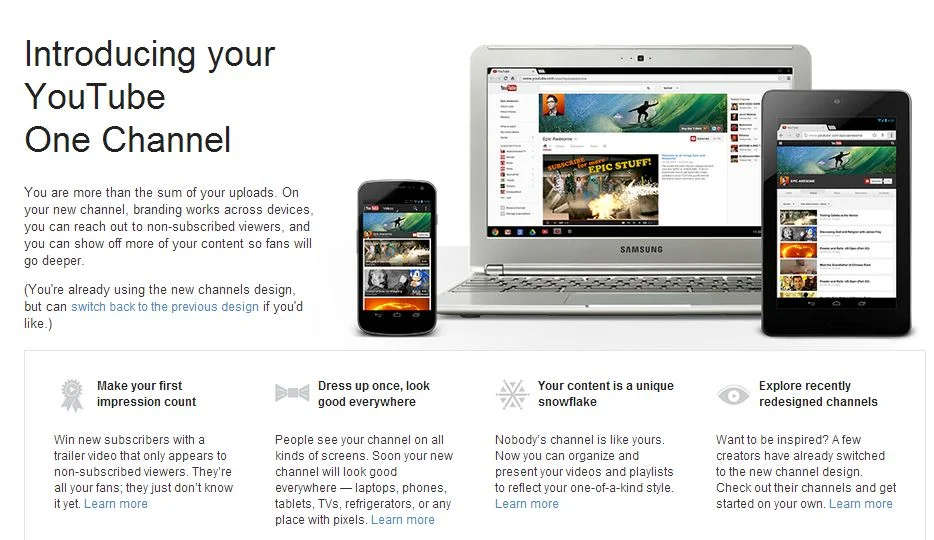
              The new YouTube One Channel layout has been available for a month or two now, but only on an opt in basis. Over 100 million users have already made the switch, but from June 5th, all channels will be automatically and permanently moved to the new design, whether they're ready for it or not! The last thing you want is for your channel and its branding to look out of sorts when the switch happens, so here are 5 Things You Must Do to Prepare For the YouTube One Channel Layout. These simple steps to get yourself ready ahead of time and take advantage of the benefits of the new layout as soon as possible.

              1. Opt In Now

              opt-in.JPG

              To be ready before the automatic switchover (and make use of the next four pointers), opt in to the YouTube One Channel layout now by visiting http://www.youtube.com/onechannel. Have a read through the overview provided if you wish, bid farewell to your old channel layout one last time, then hit the button at the bottom of the page to upgrade.

              2. Upload A Channel Icon

              500socialmedia-1354822281_600.jpg

              Once you're upgraded, upload a square, high-resolution (800px x 800px) image for your channel icon; a pic that is also recognisable at smaller resolutions. This image will be your channel’s icon all over YouTube - in search results, comments, and on your Channel Art (explained next).

              3. Upload Channel Art

              youtube-channel-art-example.JPG

              The One Channel design ditches the background branding of old and opts instead for a simple cover image known as your Channel Art. Your YouTube channel's icon sits on top of it, and you can also add clickable icons to your website and social media profiles. To get started, hover over your channel art place holder and click the pencil icon that appears in the top-right corner. In the drop-down menu, click "Edit Channel Art" and "Edit Links" respectively.

              The most effective YouTube Channel Art is an image that is optimised to display well on whichever resolution it is being viewed. To ensure yours looks great on screens from mobiles to HD televisions, use the guidelines in my template, which you can download here: Social Media Templates Page

              4. Create A Channel Trailer


              The new YouTube channel pages have two primary ways of displaying video content in the Home tab: through the Browse view or through the Activity Feed. The Activity Feed broadcasts your activity on YouTube to your subscribers, while the Browse view two different "sub-views": a view for subscribers, and a view for viewers who have not yet subscribed to your channel. For this reason, the Browse view is my preferred default, but it needs to be enabled first. Here's how:

              1. Hover your cursor over the menu bar that contains the 'Video', 'About', and 'Discussion' tabs on your Channel Page.

              2. Click on the pencil icon that appears to open the Channel Navigation menu.

              3. From here, click the button to enable the Browse feed, and then click Save. Go back to your Channel page and you'll be able to add a trailer over a place holder.

              For instructions about how to create a great channel trailer to entice in new subscribers, watch my tutorial video above. 

              5. Add Sections

              sections.JPG

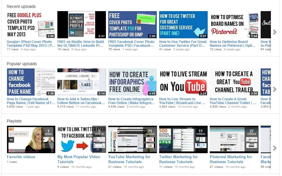
              Sections are a way for you to organise your videos into groups on your channel page, and they can either be built manually or created dynamically from video tags, likes, etc. Use sections to highlight your best content, both to subscribed and non-subscribed viewers. To begin, scroll to the bottom of your channel page and click the "Add a section" button.

              Conclusion

              So there you have it, a handful of simple and effective ways you can help make your brand's transition to the YouTube One Channel layout as painless as possible, and hopefully increase your audience at the same time. What are your thoughts on the new YouTube layout? Let me know in the comments below!


              How to Get the New YouTube One Channel Layout 2013 | (YouTube One Channel Design 2013)

               
              youtube-one-channel-design-how-to.jpg

              Following a limited beta, YouTube has now made its new One Channel design available to all users.  Here's why YouTube says it is making the change:

              “The main focus of this update is to make your new channel look great on browsers across all screens and devices. It will also help you convert more visitors into subscribers with a slot for a channel trailer, and you can customize how you organize your videos and playlists so it fits your programming strategy.”

              How to Enable YouTube One Channel Design

              1. Go to http://www.youtube.com/onechannel
              2. Scroll to the bottom of the page and click the button to enable the channel.

              I have put together a template for you to easily create channel art work that will look great on all screens, from smartphones to televisions. Click here for instructions and a download link for the template.


              ABOUT THE AUTHOR

              Andrew Macarthy is the author of the #1 Amazon Kindle Bestseller, 500 Social Media Marketing Tips. 

              Buy 500 Social Media Marketing Tips
              Amazon US: http://www.amazon.com/dp/B007L50HE6
              Amazon UK: http://www.amazon.co.uk/dp/B007L50HE6

              Follow Me:
              http://www.facebook.com/500socialmediatips/
              https://pinterest.com/500socialmedia/
              http://www.twitter.com/500socialmedia/
              http://www.youtube.com/500socialmediatips

              YouTube One Channel Template 2013 Layout FREE Download Photoshop PSD

               
              youtube-one-channel-template-photoshop-psd-download-2013.jpg

              YouTube has begun to roll out a new channel layout, which it is calling the One Channel design. At the time of writing (March 1st, 2013), the new layout is in limited beta to a select few people, but will soon be available to all. In this post, you will find a few tips to help you prepare your channel to make the most of the new layout, as well as Photoshop .psd template to help you quickly and easily create artwork that fits the new layout and displays optimally on all devices, from smartphones to massive HD televisions. 

              jacksgap-one-channel.PNG

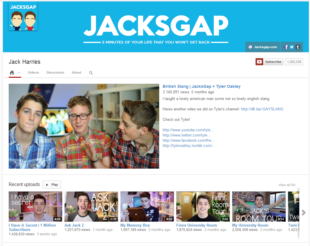
              Above is an example of the new YouTube One Channel template, which you can see is a lot more minimalist in fashion than the current layout. The artwork features the channel's profile photo to the left and links to the channel's website and social media profiles on the right. This particular design is the desktop display, but the One Channel layout's art will display differently depending on the device the site is being viewed on, so your art and template must be prepared accordingly.

              Now here's the template for the One Channel layout. YouTube recommends uploading an image that is 2120 x 1192 pixels in size. The area shaded green covers the art that will be seen on TVs, the yellow (full width of image) covers the maximum that will be seen on desktop, the blue area marks the boundaries of the design seen on tablets, and the pink rectangle marks the space where the art work will be seen at a minimum on desktops, and on mobile devices.

              In the above example, I have edited the template to feature a design that sits only within the safe (pink) zone, which will show on all devices, from televisions to smartphones. Your art could spread across the whole area of the template - where I just have white - but it is crucial that the most important portion of the design (i.e. the one you want all viewers to see) is within the safe (pink) zone.

              I hope this blog post has given you a little better understanding of the new YouTube One Channel Layout. 

              Download the template

              This template and many others - expertly measured, simple to use, and up-to-date) is available instantly as a downloadable zip file via the purchase link above. For more information on all my social media templates, click here.

              Note: Payment is fast and secure via PayPal, but you do not need a PayPal account to buy and download. 

              Get the templates FREE

              Alternatively, buy a copy of my #1 Web Marketing Bestselling book500 Social Media Marketing Tips,  on Kindle or in paperback, and receive a link to download all of my social media templates for free - you'll find it located in the Social Media Templates chapter. 


              ABOUT THE AUTHOR

              Andrew Macarthy is the author of the #1 Amazon Kindle Bestseller, 500 Social Media Marketing Tips. 

              Buy 500 Social Media Marketing Tips
              Amazon US: http://www.amazon.com/dp/B007L50HE6
              Amazon UK: http://www.amazon.co.uk/dp/B007L50HE6

              Follow Me:
              http://www.facebook.com/500socialmediatips/
              https://pinterest.com/500socialmedia/
              http://www.twitter.com/500socialmedia/
              http://www.youtube.com/500socialmediatips