5 Examples of Top YouTube End Screens | How to Make A Great YouTube End Card
/End cards or end screens are a technique that allows YouTube creators to finish a clip with a few seconds in which they can direct viewers to act - asking them to subscribe, click to view more content, visit their website, and plenty of other stuff. The possibilities are huge, and they are a simple and effective way to garner more engagement from your viewers. Here are five examples of really great end cards:
1. Food For Louis
I like the design and simplicity of Food for Louis' end screen. Viewers are encouraged to subscribe, visit his Facebook Page, and given not one, but three options for clicking through to see more stomach-churning eating challenges.
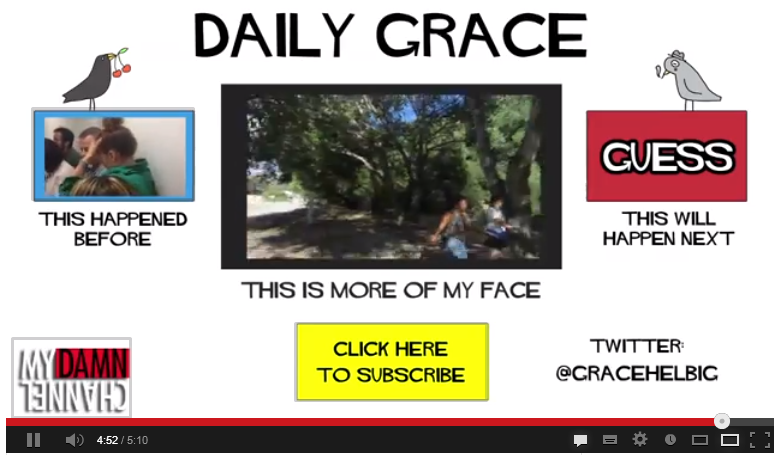
2. Daily Grace
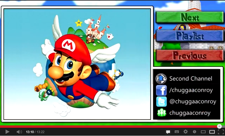
3. Chuggaconroy
Chuggaconroy is one of YouTube's most popular Let's Players (i.e. he records himself playing and commentating over videogames), and his channel and end screen designs are some of the best in the LP'ing community.Many Let's Players have more than one project ongoing at a time, so 'next', 'previous' and 'playlist' buttons (brought to life with spotlight annotations) are essential additions. Another impressive touch is the branding of the end screen, which always reflects the game in question, is neatly done, and helps to project a greater sense of professionalism.
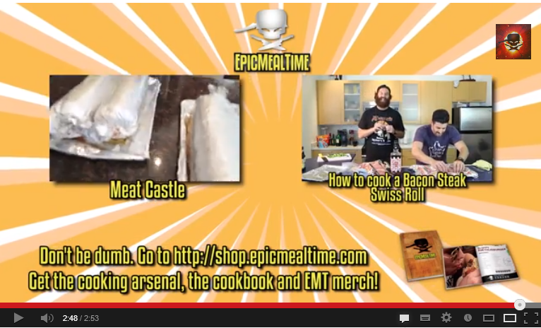
4. Epic Meal Time
In this example, not only does Epic Meal Time use its end screen as a way to tease more of its videos, but also as a a way to drive home a promotional message, encouraging viewers to visit their shop to buy merchandise.
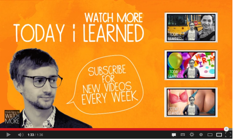
5. Today I Learned
Last up is this colourful example of an end screen from Today I learned, featuring two clear call to actions - "Watch more Today I Learned" and "subscribe for new videos every week - and a choice of three new videos thumbnails to choose from.
How do you use your YouTube end screens to encourage more engagement from viewers? Let me know in the comments below!
Andrew Macarthy is the author of the #1 Amazon Web Marketing Bestseller, 500 Social Media Marketing Tips, available for Kindle and in paperback.
Buy 500 Social Media Marketing Tips
Amazon US: http://www.amazon.com/dp/B007L50HE6
Amazon UK: http://www.amazon.co.uk/dp/B007L50HE6
Follow Me
http://www.facebook.com/500socialmediatips/
http://www.pinterest.com/andrewmacarthy
http://www.twitter.com/andrewmacarthy
http://www.youtube.com/500socialmediatips


