10 YouTube Thumbnail Ideas to Get More Clicks and Views (25+ Examples)
/Looking to create the best thumbnails for YouTube to get more views? Want to find examples and ideas to create your own custom thumbnail designs? Then keep reading!
With over 1.7 billion unique monthly visitors and 694,000 hours of video streamed on the site each day, YouTube has established itself as the most popular video platform in the world.
And if there’s one easy thing you can do to increase the potential success of your videos, it’s to include an eye-catching thumbnail to get people to click and watch. The higher your click-through rate, the better your videos will perform in the YouTube algorithm, since any interaction is a positive signal to YouTube to show your video to more people.
In this post, you will learn:
How to enable and add YouTube thumbnails
The best size dimensions for YouTube thumbnails
The best ideas to make your thumbnails clickable
How to analyze and optimize the performance of your YouTube thumbnails
… and more!
Ready? Let’s go!
What is a YouTube thumbnail?
What is a YouTube thumbnail?
A video thumbnail is a small, clickable static image alongside your videos on YouTube.
In simple terms, the main aim of a thumbnail is to get people to catch people's attention and get them to click on your video.
When you upload a video, YouTube will offer you a choice of still frames to serve as the preview image that appears alongside it in search results, but choosing one of these just won’t do if you’re serious about your video performing well. That’s where a custom thumbnail comes in.
What makes a good YouTube thumbnail?
What makes a good YouTube thumbnail?
You need to create a custom thumbnail for each and every YouTube video you upload - something that grabs the eye and communicates what your video is about at a glance.
Every YouTube thumbnail you upload should accurately portray what the video is about, - giving them an idea of what they can expect to see - while also catching the viewer's attention as they browse.
Thumbnails should also work with the video title to provide additional information about the video, without being repetitive.
Top tip: If you have existing videos whose visibility you want to improve, you can easily go into your YouTube video library and update their custom thumbnails.
Why YouTube thumbnail design is so important
Your thumbnail competing for attention against thousands of other videos, and it’s the first thing people see (before they even read the video title). Your content might be great, but if the thumbnail sucks, it can make the difference between your video being watched or ignored.
Consider the ways that people can find your videos:
By searching in the YouTube search bar
Your video appears as a related video on your channel or someone else's
In someone's subscription tab if they are subscribed to your channel
As a "Recommended for you" video whens someone is scrolling through YouTube
As part of a playlist (one you or someone else has created)
Embedded on a website or shared as a link on social media
In all of these locations, people will see your video thumbnail and title, and choose to click or not to click.
The better your video thumbnail, the more clicks it will receive. Those clicks will result in viewes and watch time, and the higher your watch time, the more YouTube will promote your video. Plus, you’re likely to gain more subscribers as a result.
YouTube thumbnail competition in search
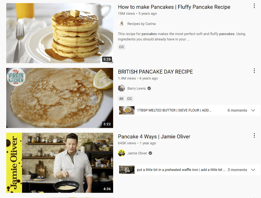
Check out the above example for a YouTube search for “how to make pancakes”. The top two results were uploaded a year apart (the top result one year later than the second, in fact). But look at the difference in view count!
Of course, plenty of other factors go into how a YouTube video performs (title, content, promotion, etc.), but given the prominence given to thumbnails in terms of screen real estate, you can see how much uploading a really effective one matters.
In the case of these pancake ones, I think we can safely agree based on the thumbnail alone, that the top result has an image that is bright and sharp, shows the finished result really well, and makes the food look delicious and clickable!
Compare that to videos two and three, whose thumbnails aren’t as attractive - the latter banking on the recognition of celebrity chef, Jamie Oliver, to drive clicks.
YouTube thumbnails in Google search results
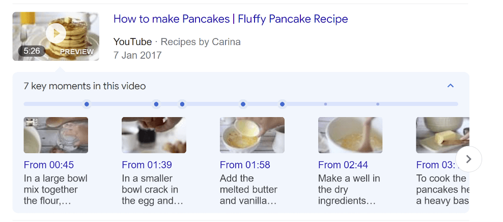
Thumbnails show up in different sizes and formats all across YouTube and outside of it (such is in Google search results and on social media), so you need to make yours is a strong, vibrant image that pops no matter what size it is. In fact, 70% of global YouTube watch time happens on smartphones and tablets.
And speaking of size…
The Best YouTube Thumbnail Size and Dimensions
Your custom thumbnail image should be as large as possible, since it will be used as the preview image in the site’s embedded player. YouTube recommends your custom thumbnails:
Have a resolution of 1280x720 (with a minimum width of 640 pixels).
Be uploaded in image formats such as JPG, GIF, or PNG.
Remain under the 2MB limit.
Try to use a 16:9 aspect ratio as it's the most used in YouTube players and previews.
Despite YouTube's recommendations above, going with a much higher resolution will future proof your videos:
HD – 1920 pixels x 1080 pixels
4K – 3840 pixels x 2160 pixels
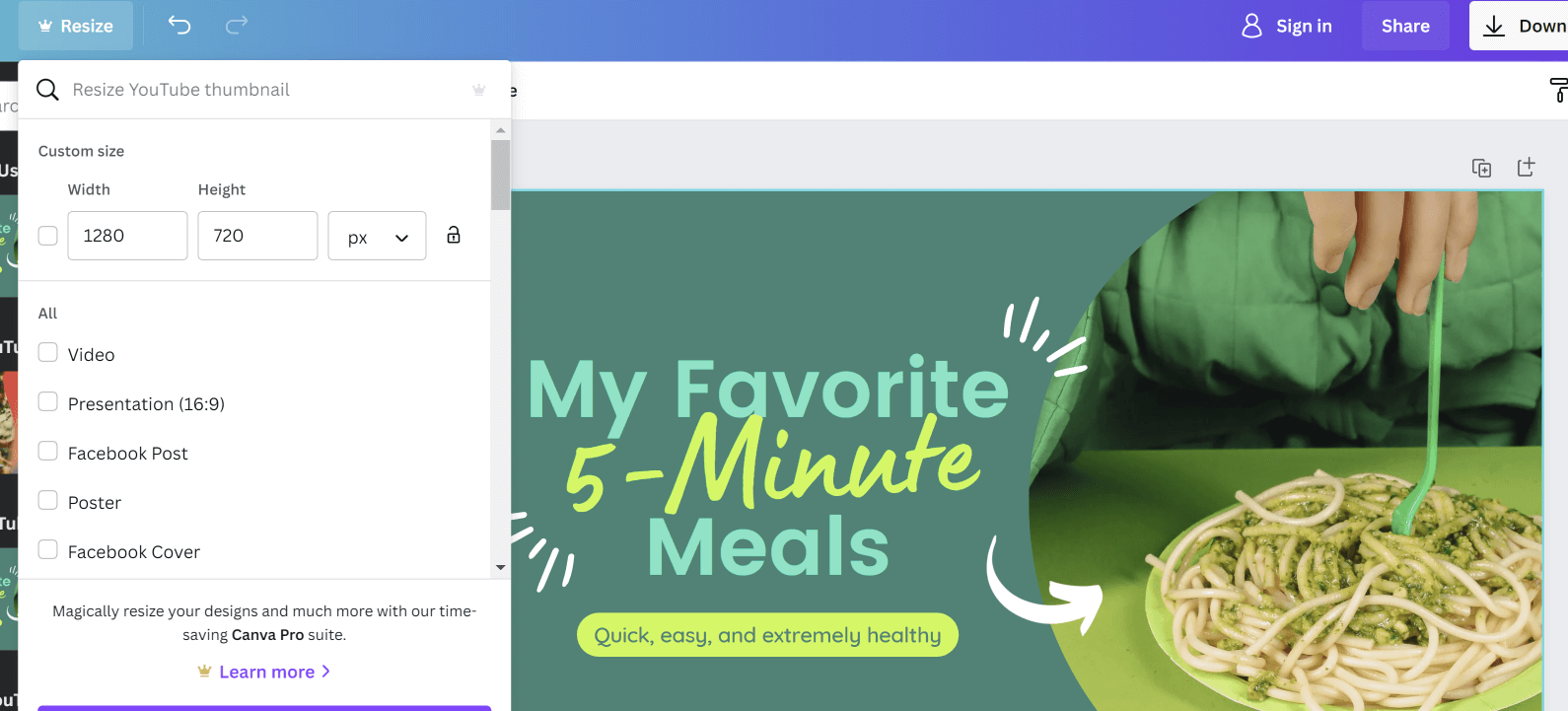
These measurements are important if you’re creating custom thumbnails in software like Photoshop, but Canva’s YouTube thumbnail template will give you the ideal size for YouTube thumbnail design one click.
If you want to re-size your design for any reason, that’s easy to do from the Resize menu. And when you’re done, you can save and download as a JPG, GIF, or PNG.
How to Enable YouTube Custom Thumbnails
How to enable YouTube thumbnails
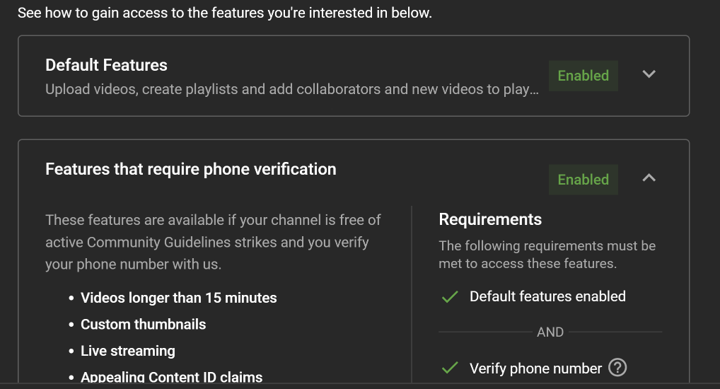
To enable custom thumbnail uploads for your YouTube videos, first ensure that your YouTube channel is eligible. Here's how:
1. Open YouTube Studio:
2. Click the Settings menu (cog icon) on the left side
3. Open the Channel setting and look for the Feature Eligibility tab.
Both Default Features and Features that require phone verification have to be Enabled before you can upload custom video thumbnails.
To verify your YouTube channel, just add a phone number to your account and follow the verification process.
The best YouTube thumbnail maker tool: Canva
The best YouTube thumbnail maker tool
The quickest and easiest way to start designing effective YouTube thumbnails (especially if you’re not design savvy) is to use a template tool.
There are a ton of options out there, but I personally use Canva for all my YouTube thumbnails and other social media graphics, videos, audio, etc. It’s been my go-to design tool for many years.
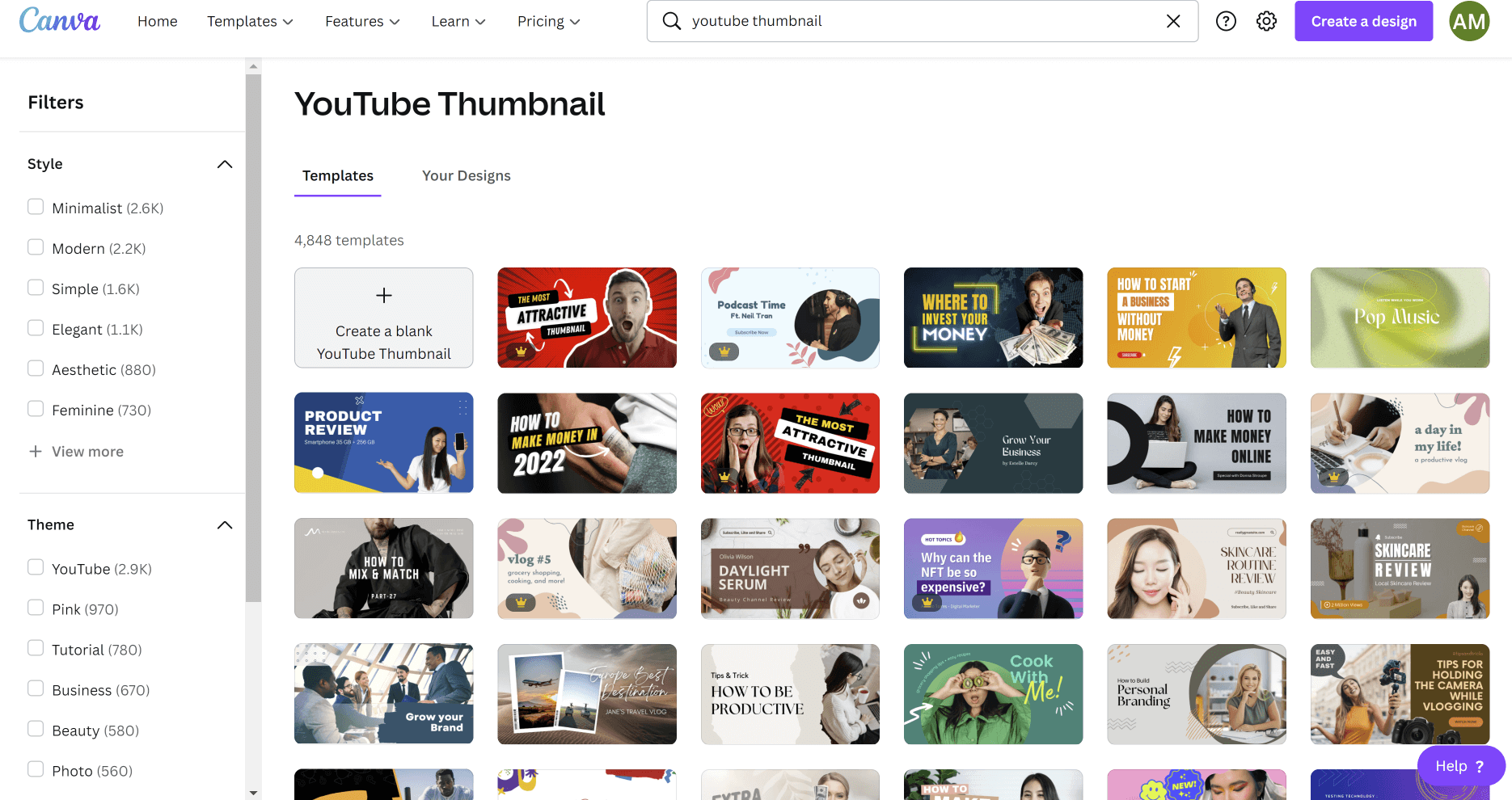
Canva offers thousands of YouTube thumbnail templates, millions of images and graphics, and just a ton of inspiration in a super easy-to-use tool.
You can get a flavour for what’s on offer in the YouTube thumbnail templates section of Canva in the image above.
Note how you can filter the YouTube thumbnail templates by style, theme, and colour. And best of all, you can pick and choose elements from one or several templates to create something that is on-brand and eye-catching for you.
Creating YouTube thumbnails in Canva
Canva’s free option is pretty decent on its own, but for premium templates and design options to help you really stand out, I recommend Canva Pro.
Canva background removal tool
Canva background removal tool
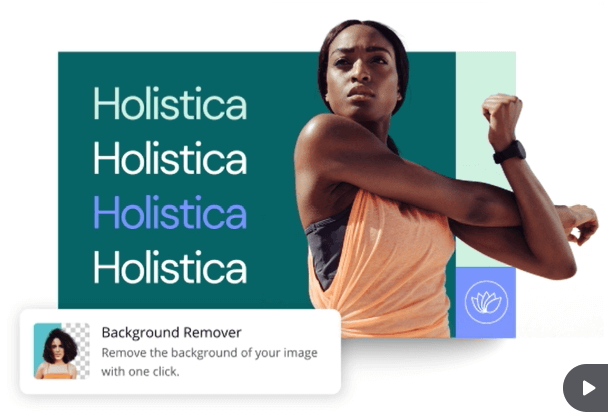
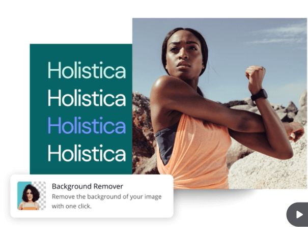
One super cool option only available in Canva Pro is the background removal feature. This allows you to take a photo of yourself and then place it on any background of your choice, removing any background scene in a simple click.
YouTube Thumbnail Design Ideas and Examples
Now that you know how important YouTube thumbnails are to get your videos noticed and watched, let’s get down to showing you some of the best tips, tricks, and best practices for designing them.
YouTube Thumbnail design tip 1: plan your thumbnail image before you film
YouTube Thumbnail design tip 1: plan your thumbnail image before you film
The thumbnail image many YouTube videos uses a still image from the video itself, but you might not always be able to grab the exact sharp and clear image that you want from in the middle of the action.
So, before you start recording, think about what you want your thumbnail image to be and plan to pause and grab it during filming - several shots from different angles. This could be an expression on your face, the before and after shot of a DIY project, a top-down shot of a cooked meal, etc.
The best view in London. Show the Shard.
How to make a banoffee pie. Show the pie.
The hardest LEGO build ever. Show the Eiffel Tower.
YouTube Thumbnail design tip 2: keep your design simple
YouTube Thumbnail design tip 2: keep your design simple
One of the biggest mistakes that people make when designing YouTube thumbnails is to make them the design too complicated.
If you try to convey too many ideas or emotions or ideas in the thumbnail image, it will be cluttered, unattractive, and attract less clicks.
If someone has to spend more than a second or two to decode your thumbnail, the chances of them clicking on it diminish.
So, focus on the central idea of your video for its thumbnail.
YouTube Thumbnail design tip 3: use exaggeration and human faces to elicit an emotional response
YouTube Thumbnail design tip 3: use exaggeration and human faces to elicit an emotional response
When a viewer’s eyeballs clock your thumbnail image, you want it to stop them in their tracks and pay attention. One of the best ways to do this is with exaggeration - whether that be an emotion on someone’s face or in the scenery shown in the thumbnail.
We know that the "quietest room in the world" that Ryan Trahan endures isn't going to look anywhere near as dramatic as in the thumbnail. And his pained expression isn’t likely something he is going to show for the entire time.
And we know that tasting foods people don’t like isn’t going to leave someone with the most joyous of expressions, but we know it’s not always going to be as dramatic as the thumbnail shows.
These examples draw the viewer’s attention are exaggerated and click-baity, but the videos do deliver on what the title says, and so viewers don't mind.
Large, zoomed- in faces work better than faces that are further away for showing emotion, but a mid-shot can give more room to add in important video elements.
Consider the two examples from Mr Beast above, in which a zoomed-in face and mid-range shot are used to brilliant effect.
Let’s look at some more extremes of emotion that work for effective thumbnails, sometimes called YouTube Face - clickbait attaining human form:
Fear
Here, we get a juxtaposition between a frightening game and Daz Games’ exaggerated reaction. Is he that scared of the game? Unlikely, but the degree of fear he shows in the thumbnail makes it clickable.
Anger
Here, we see the anger in Carter Sharer’s girlfriend’s expression. The thumbnail catches the eye, and the title works to explain why she’s so mad.
Disgust
Here’s the SidemenReacts channel uses disgust as an extreme emotion to stop people scrolling and encourage them to click and watch. Notice the contrast added to KSI’s face to further exaggerate the emotion.
Happiness
Here, Atrioc focuses on the happiness of a marriage proposal in his thumbnail. Notice the contrast between the foreground and background - the latter blurred as a teaser for what the video includes.
Sadness
The sadness and shock on the faces of these two men contrasts with the black background to make the thumbnail stand out, and the title helps to provide context.
Shock
Faze Rug’s reaction to his new house purchase is obviously over the top, but as a thumbnail showing shock and surprise, it works to be super clickable.
Worry
Here’s that juxtaposition between an emotion and a still from the video, with a red arrow to draw your attention to it for good measure. Here, worry is the expression used to help draw viewers into clicking.
Despair
Here, we don’t see Kamila Valieva’s face, but we can tell from the hands over her face that she is despairing over her ice skating performance. We’ll have to watch to see what exactly happened to make her feel like that.
YouTube Thumbnail design tip 4: Convey action and energy
YouTube Thumbnail design tip 4: Convey action and energy
This tip links to the one above, but instead of using a human face to connect with viewers, conveying action and energy is another way to grab the attention of users.
YouTube Thumbnail design tip 5: Use a text overlay
YouTube Thumbnail design tip 5: Use a text overlay
As well as a YouTube video title and thumbnail image working together, a text overlay in your thumbnail can create a powerful trio of video marketing elements.
Your thumbnail text can work as a catchy teaser for your video, or to help provide more context for the viewer.
However, don’t simply repeat the text you have used in your title. Instead, use a maximum of 2-4 keywords to highlight what your video is all about or what viewers can expect to see or feel when they watch, even if they haven’t read the title.
If you do use text, make the font really large so that it can be read on mobile and desktop devices. Also consider your font colour carefully, so that it contrasts well against your main thumbnail image and is easy to read.
Using text in your thumbnail image isn’t essential, however. Sometimes an image alone is more striking and effective on its own; it really depends on the kind of video and message you are trying to portray.
YouTube Thumbnail design tip 6: the best font to use for thumbnails
YouTube Thumbnail design tip 6: the best font to use
In general, sans serif fonts such as Impact, Helvetica, Bebas and Ariel work best for YouTube thumbnail text because their clean lines make them easy to read at large and small sizes. The small details of serif fonts make them trickier to read at smaller sizes, and against certain backgrounds.
YouTube Thumbnail design tip 6: the best font to use
Handwritten fonts provide another conundrum. They aren’t very easy to read on small YouTube thumbnails, but they do add a personal touch, which might work with the videos you are posting. If you do want to use a handwritten font, try and find one that is as easy to read as possible (test it at different sizes), and limit the number of characters you include.
YouTube Thumbnail design tip 7: use contrast to draw the eye
YouTube Thumbnail design tip 7: use contrast to draw the eye
In everyday photos, too much contrast can make an image appear unnatural and unattractive. But in YouTube thumbnails, high contrast makes the image more noticeable.
As well as contrast in the image as a whole, juxtaposing two contrasting colours can work to help your thumbnail pop off the screen and catch people’s attention.
YouTube Thumbnail design tip 7: use contrast to draw the eye
Or, you might choose to use a contrasting effect around people or objects in the thumbnail itself to make them stand out more prominently.
YouTube Thumbnail design tip 7: use contrast to draw the eye
Sometimes thumbnails with just one background colour make a really great option. They're really easy to create in Canva and the contrast effect that you can make can be really striking. Single colour backgrounds also mean that your text overlay is really easy to read.
YouTube Thumbnail design tip 8: show the end result
YouTube Thumbnail design tip 8: show the end result
As I mentioned above, planning thumbnails for videos that show the before and after of a process is a really great way to produce eye-catching thumbnails.
Showing the end result is also a great way to grab viewers’ attention because they will be intrueged about how you made it happen.
Cooking recipe thumbnails are the most obvious example of this - a close-up shot of a delicious meal will tempt plenty of people to click. But as in the example above for hair braiding, it can work for a whole host of video types.
YouTube Thumbnail design tip 9: play with perspective
YouTube Thumbnail design tip 9: play with perspective
Artists have experimented with perspective and distortion for centuries, and that trend continues on YouTube.
Perspective can be used creatively in YouTube thumbnails to distort the normal measurement of objects in order to make them stand out - making them big or small, further away or closer to the screen. This visual illusion can be used to make the thumbnail objects jump out of the screen and become more clickable.
YouTube Thumbnail design tip 10: brand consistency
YouTube Thumbnail design tip 10: brand consistency
Consider branding your thumbnail images with consistent text, images and style - especially those that form part of a single series.
When your subscribers recoginise a video as one from your channel, they are more likely to click and watch it - and consistent branding makes that much more likely.
Most creators customize their YouTube thumbnails with their brand colours, the creator's face, or a specific text overlay style.
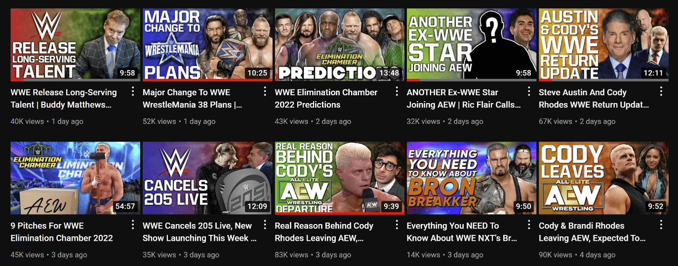
Cultaholic makes videos about the world of professional wrestling. Its thumbnail design in format, font, and colour styling make its videos instantly recognisable in people’s feeds.
YouTube Thumbnails Analytics with Analytics
Once you've started publishing YouTube videos with enhanced thumbnail design, it's important that you use YouTube's Analytics to track their performance.
YouTube thumbnail analytics and the Reach tab
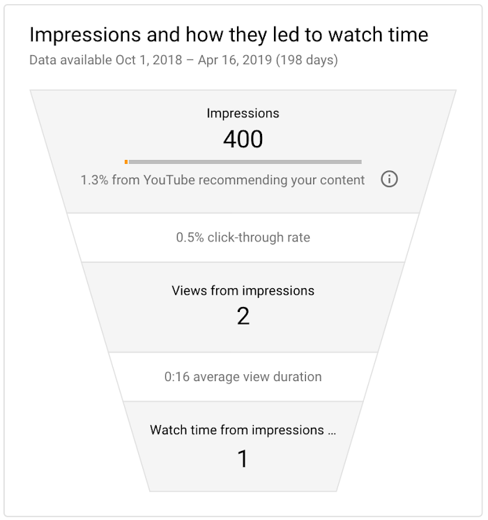
Use YouTube Analytics Reach tab to understand your video's traffic. You'll see the number of times that your video thumbnails were shown on YouTube, and how those thumbnail impressions turned into views (the click-through rate) and watch time.
YouTube thumbnails analytics
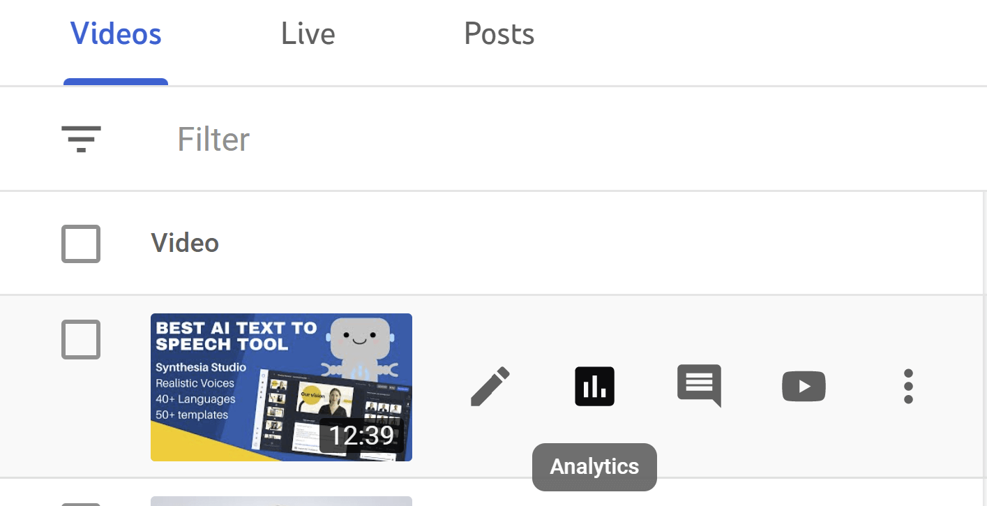
To find this data:
1. Sign in to YouTube Studio.
2. Click on the Content tab
3. Select the analytics (chart icon) next to the specific video you want to see data about.
YouTube thumbnail analytics
The key metrics card at the top of the Reach tab gives you an overview of your impressions. The card also gives you info on click-through rate, views and unique viewers over time. This data is available within a few hours of publishing your video.
If your click-through rate is high, but your average view duration is low: a lot of people are clicking (good thumbnail!), but they aren't watching the whole video (issue with your content).
If your click-through rate is low, but your average view duration is high: not many people are clicking the thumbnail (thumbnail design issue), but those that do are sticking around to watch your videos (great content).
YouTube thumbnail analytics and watch time
YouTube watch time duration in analytics
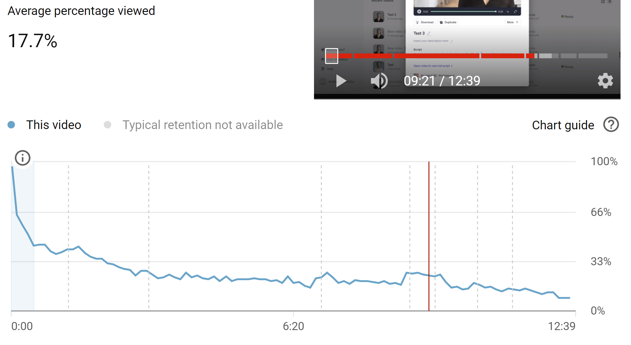
If you then switch back to the Overview tab of the video analytics, scroll down to see the Average Percent Viewed chart.
If you notice comparative to the number of impressions and click-through rate, do you have a long average view duration or is it low? This will help you evaluate how your video and its thumbnail is doing.
Within the first 30 seconds of this graph, is there a steep decline in viewership? Retaining around half of viewers at 30 seconds is pretty typical, but if your stats show worse, there could be an issue.
Have a think whether it is your content or thumbnail/title (i.e. what they promise viewers who click) that is the problem.
YouTube thumbnail analytics and trends
Most popular videos in YouTube analytics
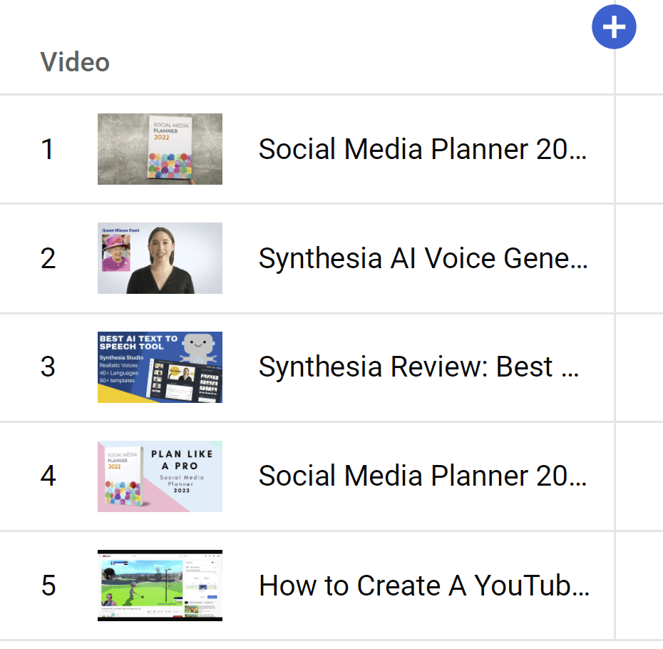
You might also be able to identify trends in your channel content and thumbnail performance that you may not be aware of.
Go to the main Analytics page for your whole channel (not video specific as above.
Scroll right to the bottom of the overview tab of your video analytics and click "SEE MORE”.
On the chart page that appears, click “COMPARE TO…” in the top-right and choose “First 24 hours video performance”.
In the drop-down menu above the new chart that appears, select “Impressions click-through rate”.
Look at the thumbnails in this graph and notice what videos are performing well, and their thumbnails. Do you notice a trend in the images used, facial expressions, colours, or fonts?
YouTube Thumbnails Frequently Asked Questions
Now that you know all about the importance of creaing great YouTube thumbnails and how to make them, let’s answer some of the most frequently asked questions relating to video thumbnails.
What YouTube thumbnails get the most clicks?
As we’ve discussed above, there are a wealth of different strategies to help optimise your YouTube thumbnail to encourage more clicks. Which thumbnail ideas work best for you depends on your content and audience, but in general the thumbnails that get the most clicks are those that catch people’s attention and make people think “I HAVE to watch this video.”
Which color thumbnail is best for YouTube?
Again, colour choice is subjective based on your content and audience - there is no one best solution. However, we can say that high contrast colour combinations help to make YouTube thumbnails “pop” off the screen and better grab the attention of viewers.
What is the best YouTube thumbnail maker?
There are a ton of design tools for YouTube thumbnails, but my recommendation for its wealth of templates, graphics, background remover feature, and ease of use is Canva. Click here to try Canva Pro free for 30 days.
Why do YouTube Thumbnails have red arrows?
The use of red arrows in YouTube thumbnails has become extremely popular as a tactic to draw people’s attention to a certain object or action within the thumbnail image. Red arrows do have a bit of a reputation for being related to click-bait-y videos. So if you do use them, make sure you deliver on what the thumbnail promises.
Over to you
Which YouTube thumbnail ideas did you like the best? Are there any strategies for getting more clicks from thumbnails that I missed? Let me know in the comments below!
Pin this Post!
YouTube Thumbnail Ideas to Get More Clicks and Views
Andrew Macarthy is a social media consultant and the author of the #1 Amazon Web Marketing Bestseller, 500 Social Media Marketing Tips.
Buy 500 Social Media Marketing Tips
Amazon US: http://www.amazon.com/dp/B007L50HE6
Amazon UK: http://www.amazon.co.uk/dp/B007L50HE6
Follow Me:
http://www.facebook.com/500socialmediatips/
http://www.pinterest.com/andrewmacarthy
http://www.twitter.com/andrewmacarthy


