4 Ways Snapchat is A Great Marketing Tool For Brands and Businesses


Snapchat's growth over the past two years has been incredible, and with over 200 million photos and videos shared by its users every day, it is fast gaining the attention of brands and marketers who want a piece of its young and engaged audience. 

I'll save the particular methods of promotion using Snapchat for another time, but in this blog you'll learn four ways in which the make up of the app means that it is a great marketing tool for brands and businesses. 

1. The scarcity and exclusivity of its messages

Once a Snapchat users receives and opens an image or video, they have a maximum of 10 seconds to view it before it disappears and they can not access it again. For brands, this provides a sense of scarcity that posting to other social networks like Facebook or Instagram cannot provide. 

For brands who want to offer vouchers or promotions through Snapchat, the app provides a means by which the offer can be limited only to its followers, with no chance of it going viral as it'll disappear shortly after opening. That theory might sound counter-productive at first, but the feeling a consumer gets when they feel part of something small and exclusive is hugely powerful in terms of garnering brand loyalty.

The image above shows a promotion by New York-based 16 Handles, which exemplifies this approach.

2. The unexpectedness and surprise in its messages

The disposable nature of Snapchat's messages is loved and accepted by the app's millions of users, and brands can use this to their advantage. Many Snapchat viewers see receiving a message as a present. There's no way of knowing what it contains until a user opens it, and this element of surprise can be harnessed by marketers to provide all manner of messages and promotions.

3. The purity of its messages

Unlike Instagram with its carefully orchestrated photos and filters, Snapchat photos - because they have to be consumed so quickly - encourage a purity of message that its rivals cannot. This frees brands from the habit of overthinking or micro-managing the message they want to construct, and sets them free to provide content that is off the cuff, "real", and that will resonate with their audience. The example above is a photo sent by Taco Bell to its followers on Snapchat to promote its Beefy Crunchy Burrito - simple but effective.

4. The brevity of its messages

Being that Snapchat messages only exist for a matter of seconds, there is little room for pride or embarrassment from the sender. While it is clear to see how this would relate to individuals (particularly in the prevalence of "adult" messages being sent between users!), it also has significance for brands, who can move on from misjudged or poor-performing content in no time at all. In comparison, if you posted a status update on Facebook, it lingers there for a lifetime in comparison to Snapchat. And if that content was poorly received, there is plenty of time for your audience to communicate their dissatisfaction.


ABOUT THE AUTHOR
Andrew Macarthy is the author of the #1 Amazon Web Marketing Bestseller, 500 Social Media Marketing Tips, available for Kindle and in paperback.

Buy 500 Social Media Marketing Tips
Amazon US: http://www.amazon.com/dp/B007L50HE6
Amazon UK: http://www.amazon.co.uk/dp/B007L50HE6

Follow Me:
http://www.facebook.com/500socialmediatips/
https://pinterest.com/500socialmedia/
http://www.twitter.com/500socialmedia
http://www.youtube.com/500socialmediatips

portrait-blog.jpg

How to Convert A Blog Post to PDF for Slideshare | Slideshare Conversion Marketing

One of the coolest functions of Slideshare is that, if you upload a PDF document to your account, it will automatically convert the file into a presentation that can be read, shared, and embedded elsewhere by anyone on the site. A good way to utilise this feature is to convert your blog posts into PDF files and then upload them to Slideshare for extra exposure. The process is really easy and only takes a couple of minutes to complete. Here's how: 

1. Convert your blog into a PDF

To convert your blog post into a PDF, I recommend the tool over at www.printfriendly.com. Once there, paste your blog post's URL into the bar at the top of the site and click "Print Preview." Alternatively - and this is the way I do it - install the PrintFriendly browser extension and simply click it when you're on the page of the blog post that you want to convert. I prefer the latter method as sometimes the former does not pull in the blog's images.

2. Delete unwanted text

Once PrintFriendly has grabbed your blog post, hover over the different paragraphs of text and any images, and they will highlight yellow with a "Click to delete" message. Remove any unnecessary elements that will clog up your eventual Slideshare presentation. In my case, I remove the blog title at the top (reason for this coming up) and blurb about me from the bottom of the post. When you're done, click the "PDF" button.

3. Download your PDF

PrintFriendly will spend a few seconds generating your PDF. When it's done, choose the A4 Page Size option and click the button to download it ready for uploading to Slideshare.

4. Upload your PDF to Slideshare

Sign into Slideshare, click the Upload button and choose the PDF you just created. Slideshare will grab the file and convert it into a presentation for the site. Nice! 

5. Optimize the title, description, category, and tags

Visit your Slideshare uploads and click on the presentation you have just created to edit its settings, which by default won't be great at all. I simply copy and paste the title and tags from my blog post, and lift the "stock" description from my YouTube channel (which includes a call to action to buy my book, links to my social profiles, and a more blurb about the presentation) and paste it all in. Don't forget to choose the correct category, then save the changes.

6. You're done! ... But a tip about image use and thumbnails! 

Here's an example of how your presentations will display in Slideshare search results. As you can see the thumbnail that appears is the image that appeared at the top of my blog post.  If the top of your blog post is just text, then your thumbnail on Slideshare will be as well, which won't make it too visually appealing. I know it won't be possible for everyone, but if you are going to convert blog posts for Slideshare, having an image at the top of your blog post - even if temporarily while you convert to PDF - can make a huge difference.

The final result! 

Here it is, my blog post converted into a Slideshare presentation and embedded using the code provided. Users can click the arrows to view each page, and zoom in to read the text easier with the magnification tools, or by going full screen.

Of course, a text-heavy blog post is never going to replace a presentation built from the ground up and optimised for Slideshare, but as far as convenience and the extra exposure to millions of Slideshare users goes, it is well worth doing. 

ABOUT THE AUTHOR
Andrew Macarthy is the author of the #1 Amazon Web Marketing Bestseller, 500 Social Media Marketing Tips, available for Kindle and in paperback.

Buy 500 Social Media Marketing Tips
Amazon US: http://www.amazon.com/dp/B007L50HE6
Amazon UK: http://www.amazon.co.uk/dp/B007L50HE6

Follow Me:
http://www.facebook.com/500socialmediatips/
https://pinterest.com/500socialmedia/
http://www.twitter.com/500socialmedia
http://www.youtube.com/500socialmediatips

How to Share Instagram Photos to A Facebook Page | Post Instagram Images to Facebook Page


The introduction of hashtags on Facebook have made the effect of sharing Instagram images onto social media even mor powerful. If you want to set your Instagram app account up to share photos right to your Facebook Page - not your personal timeline - here are some simple instructions:

1. Open up the Instagram app and visit your profile page 

2. Click on the cog icon at the top of your profile page 

3. Click on the "Share Settings" option

4. Click on "Facebook"

5. Click on "Share Photos to" ...

6. Choose your Facebook Page from the "Choose A Page" list

And that's it! Now, when you share a photo from Instagram to Facebook, it'll go straight to the Facebook Page you chose. 


ABOUT THE AUTHOR

Andrew Macarthy is the author of the #1 Amazon Web Marketing Bestseller, 500 Social Media Marketing Tips, available for Kindle and in paperback.

Buy 500 Social Media Marketing Tips
Amazon US: http://www.amazon.com/dp/B007L50HE6
Amazon UK: http://www.amazon.co.uk/dp/B007L50HE6

Follow Me:
http://www.facebook.com/500socialmediatips/
https://pinterest.com/500socialmedia/
http://www.twitter.com/500socialmedia

http://www.youtube.com/500socialmediatips

portrait-blog.jpg

How to Add Admins or Managers to A Google Plus (+) Page

how-to-add-managers-admin-google-plus.jpg

If your Google+ business page is particularly busy, you may want to hand the responsibility of handling it over to one or more trusted employees. For these instances. The process is really easy and only takes a few moments, but first it's handy to know...

The differences between an owner and a manager

Google+ allows you to assign up to 50 managers to your page, all who have basic admin rights, while you retain ownership. Here's a summary of the differences between an owner and a manager: 

How to  add a manager to your Google+ page

1. Sign in to Google+ and visit your page, then choose Settings from the left-hand menu.

2. On the next page, click the Managers link at the top.

how-to-add-manager-admin-google-plus-step-3.png

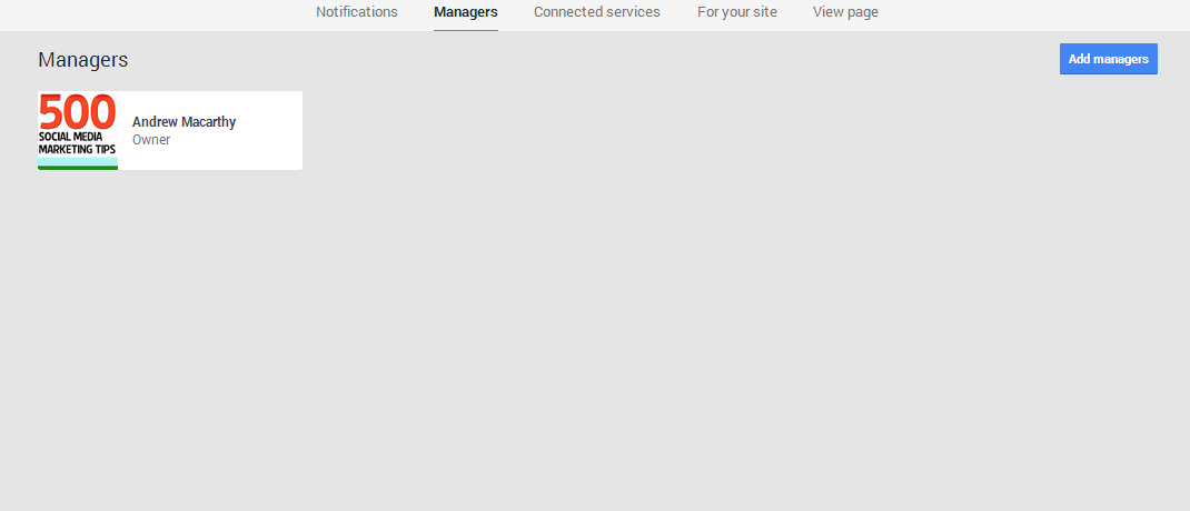
3. This is the page where all of your managers will be listed. Click the Add managers button to invite a new one.

how-to-add-manager-admin-google-plus-step-4.PNG

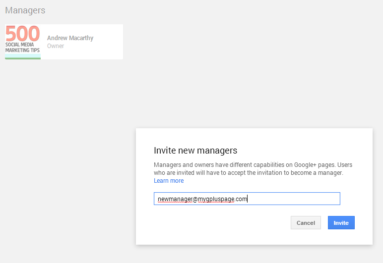
4. Simply enter the e-mail address of the person you want to add as a manager and click the Invite button.  (Note: people can accept invitations to become managers, and sign up to Google+ if they haven’t already, with a different email address than the one the invitation was sent to).

When a invitation is accepted, the owner of the page - you - will be notified via email.


ABOUT THE AUTHOR

Andrew Macarthy is the author of the #1 Amazon Web Marketing Bestseller, 500 Social Media Marketing Tips, available for Kindle and in paperback.

Buy 500 Social Media Marketing Tips
Amazon US: http://www.amazon.com/dp/B007L50HE6
Amazon UK: http://www.amazon.co.uk/dp/B007L50HE6

Follow Me:
http://www.facebook.com/500socialmediatips/
https://pinterest.com/500socialmedia/
http://www.twitter.com/500socialmedia
http://www.youtube.com/500socialmediatips
5 Ways to Make Pinterest Images That Get More Repins, Likes, and Comments

What is the world's most perfect Pinterest pin? 

effective-perfect-pinterest-pin-image-ever.jpg

For over a year, boffins at Curalate in Philadelphia studied millions of Pinterest photos and their engagement levels to try to figure out what makes the perfect Pinterest image. The answer combines a number of characteristics, exemplified by the image above: "Aunt Peggy's Cucumber, Tomato, and Onion Salad" by cooking show host, Paula Deen. At the time of writing, it has been repinned over 300,000 times, liked over 8,000 times, and commented by over 300 people.

What elements make up the perfect Pinterest pin? 

Amongst the most popular images on Pinterest and Instagram, Curalate found that they all shared the following characteristics. Take a look, and work at feeding them into your own stream to encourae more engagement from your customers:

Portrait layout

 Images for Pinterest that are taken in a vertical orientation (with an aspect ratio between 2:3 and 4:5) perform better than those snapped in landscape. This is because Pinterest displays all photos in a vertical orientation, making those uploaded in other ratios look squashed and small.

Unobtrusive backgrounds

Curalate found that product images taken against a plain, artificial background - specifically if the background makes up more than 40 per cent of the total image area - see their amount of repins halves or even quartered compared to others. Instead, the best-performing pins use a minimal background that still provides compelling context.

No human faces

Somewhat surprisingly - as marketers often feel that people connect with images of other humans - images without faces get repinned more than those that have them. Curalate surmises that this is that while Facebook, for example, is the social network of people, Pinterest is the social network of things. And on a network of things, people's faces only serve as a distraction.

Multiple colours and lots of red

Pinterest pins with multiple dominant colors garner more than three times the replies as images with just one, it was found. In addition, images that were made up predominantly of red or orange images were found to get twice the repins as predominantly blue images.

Moderate light

Very light and very dark images are, on average, repinned one-twentieth as often as images with medium lightness.