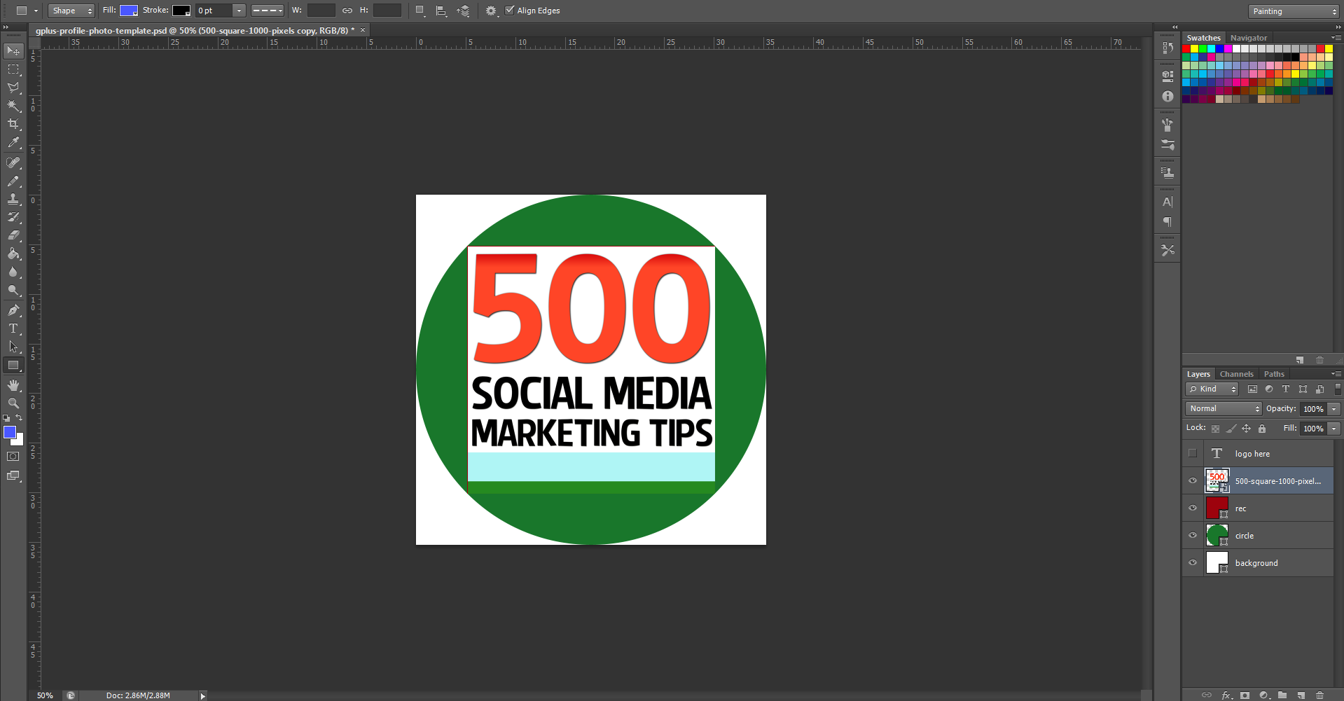
When you first open the template, this is what you will see. The green circle represents the Google+ profile photo circle, while the red square shows the "safe" area in which you can add your square logo design. You've got some leeway in all four directions outside of the red square, but anything that passes into the white area will not be visible. So, first of all, hide my "Place your logo within this red square" layer and insert your logo on top of the red square layer instead.
Note: I have chosen a white background for this template to match and blend seamlessly the white of the Google+ layout, though you may choose to experiment with different colours if you wish. If you delete the background and make it transparent, Google+ will not recognise it, and replace your image with a black background by default.


