Google Plus Profile Photo Template for Square Logos | FREE Download PSD Photoshop
/Google Plus Doesn't Like Square Logos
In the first major design change to Google Plus earlier on this year, the social network's profile photos were changed from a square to a circle. While a circular shape works well for head and shoulder photos of individuals and plenty of company logos, if your logo is a square shape - like mine for 500 Social Media Marketing Tips is - then, by default, it doesn't fit... some proper squarelogoism going on from Google! As you can see from the examples in the image above, uploading a square logo sees it being cropped on all four corners, and it just looks messy. Even if you play around with the site's cropping or scaling tools, you really fix it.
The Solution: A Google Plus Profile Photo Template
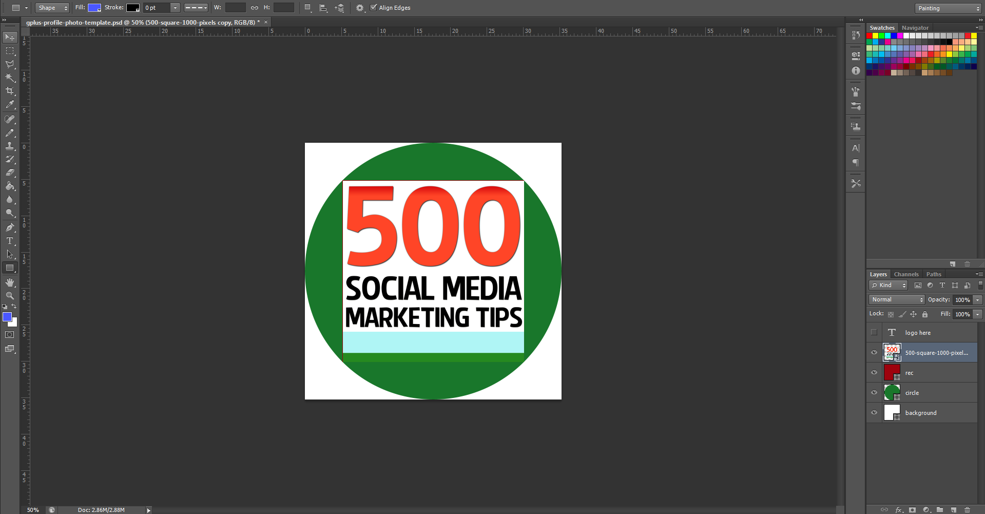
As a work around to this problem, I have built a simple template for Photoshop or GIMP that will allow you to create and upload a square logo that fits inside the default circular parameters, as in the image above. Of course, you stand to lose a smidgen profile photo "real estate," but what you gain is logo that will display without cropping on your cover photo, and next to every post and comment you make around the site.
The template is 1000 x 1000 pixels big - four times the minimum size that Google+ recommends - meaning your logo will enlarge into a nice, large image when clicked on from your page.
How to Use the Template
When you first open the template, this is what you will see. The green circle represents the Google+ profile photo circle, while the red square shows the "safe" area in which you can add your square logo design. You've got some leeway in all four directions outside of the red square, but anything that passes into the white area will not be visible. So, first of all, hide my "Place your logo within this red square" layer and insert your logo on top of the red square layer instead.
Note: I have chosen a white background for this template to match and blend seamlessly the white of the Google+ layout, though you may choose to experiment with different colours if you wish. If you delete the background and make it transparent, Google+ will not recognise it, and replace your image with a black background by default.
Once you have inserted your logo, hide the red square layer and you'll have something like this.
To finish, hide the green circle layer to remove all traces of the template, as above, and save your image as a PNG or JPEG file.
Uploading the Profile Photo
Visit your Google+ page and click on your existing profile profile photo to upload your new one in its place. When you select the file and it uploads, make sure to drag the cropping lines all the way out to the corners , as above. If you don't, your logo will not look right. When you're done, click the "Set as profile photo" button.
The Finished Result
Here's that finished result once again. Hopefully yours will look very similar!
Download the template
This Google+ template (and several others for all the biggest social networks - expertly measured, simple to use, and up-to-date) is available instantly as a downloadable zip file via the purchase link above. For more information on all my social media templates, click here.
Note: Payment is fast and secure via PayPal, but you do not need a PayPal account to buy and download.
ABOUT THE AUTHOR
Andrew Macarthy is the author of the #1 Amazon Web Marketing Bestseller, 500 Social Media Marketing Tips, available for Kindle and in paperback.
Buy 500 Social Media Marketing Tips
Amazon US: http://www.amazon.com/dp/B007L50HE6
Amazon UK: http://www.amazon.co.uk/dp/B007L50HE6
Follow Me:
http://www.facebook.com/500socialmediatips/
https://pinterest.com/500socialmedia/
http://www.twitter.com/500socialmedia
http://www.youtube.com/500socialmediatips


