NEW Twitter Background Template 2014 PSD | 1920 x 1200 Photoshop Download
/Looking for a background template for the new Twitter design for April 2014? You've come to the right place.
Notable change
before we get started, it's worth knowing that the Twitter profile background image no longer appears on the main profile page of a user - the new large header image can now be used for that. However, background designs do show when a user clicks on a tweet to view it (and the conversation attached to it) in isolation.
Example
Here is an example of the new Twitter layout. Notice that the new header takes up much of the "above the fold" space, where the old background design used to be. Below it, however far you scroll through the tweet feed, is an uneditable grey background.
Example 2
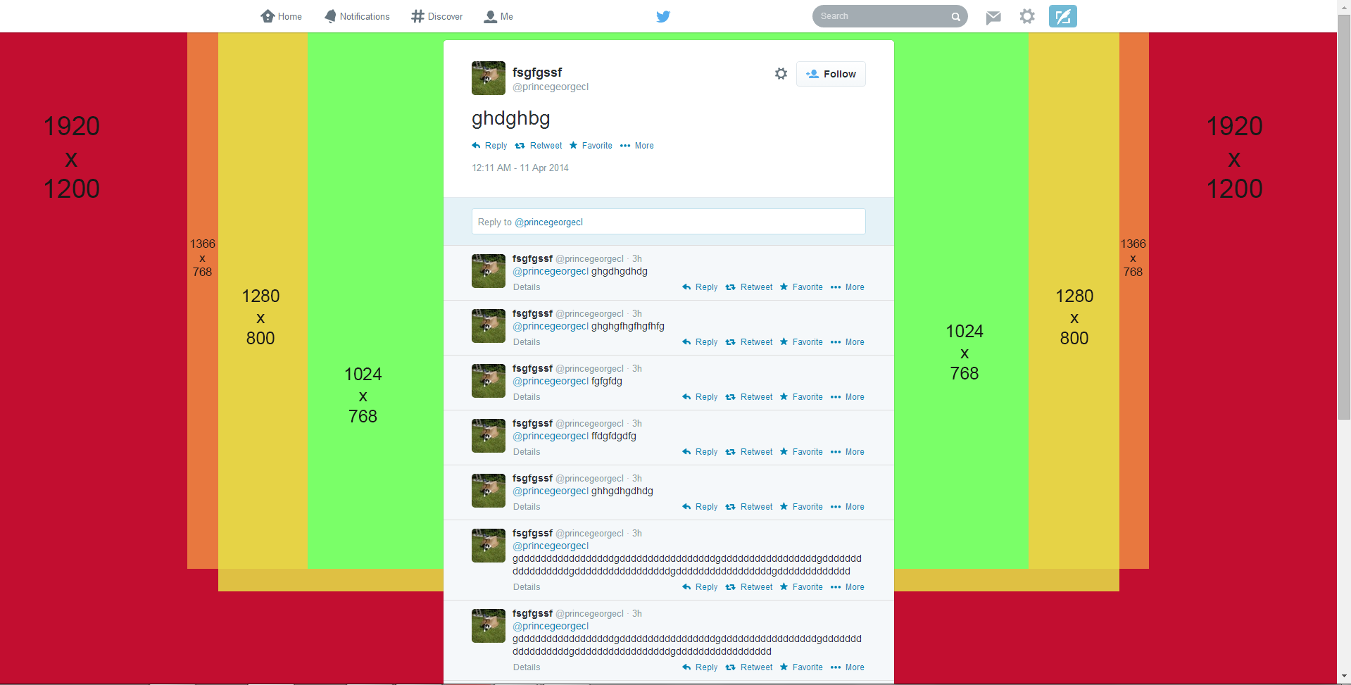
The above image shows what a user sees when they click on an individual tweet. Here, the background design you upload will display. In this case, it's a plain textured image but you can use the space for whatever you like: contact info, logos, offers, etc.
The trouble with Twitter background design optimisation
Twitter profile backgrounds are a a prime piece of real estate for brands, but creating one that is optimised to be seen as intended by as many users of the site as possible can be tricky due to the wide variety of screen resolutions that the site is browsed at on desktops. Problems include:
- Design hidden behind the tweet feed
- Design looks different from one screen to another
- Design not optimised for largest resolutions, leaving blank areas.
If you've ever had any of these problems, my free Twitter background template will help. But, before we get to it, let's take a look at the relationship between Twitter, screen resolutions, and Twitter background designs so that you can use the template as effectively as possible.
The Anatomy of A Twitter Page Explained
No matter what the resolution of a user's desktop display, the Twitter tweet feed will always sit in the centre of the page. That leaves an equal amount of space either side of it for the visible background design (the rest being hidden behind the tweet feed itself). How much of the design is visible by a user, then, depends on the resolution of their display.
Therefore, in designing your Twitter background, you should aim to cater to as many people using as many different resolutions as possible, especially if you want to feature branding on both sides of the feed. Which leads us nicely onto...
Global Statistics For Screen Resolutions
According to the most recent global statistics (updated April 2014) the most popular screen resolution for viewing the web on desktops is 1366 x 768 pixels (around 28% of the total) followed by 1024 x 768 (around 8%). From these numbers (and those for less common sizes), we can estimate that the vast majority of people viewing your Twitter profile will be able to appreciate a background design optimised for a 1366 x 768 pixel resolution.
Optimising Your Twitter Background Design
The biggest resolution people are likely to view Twitter at is 1920 x 1200 pixels, so the template is offered at this size and I urge you to design with people viewing at this resolution in mind, but optimised for the majority who only see up to 1366 x 768 pixels, i.e. when using the template, put your most important branding elements - logo, products, offers, URLs within the orange box and any non-important info outside it. View the image above for examples of how much of the visible Twitter background will appear for users at different resolutions.
How to Use the Twitter Background Template
When you open up the Twitter Background template in Photoshop or GIMP, it will look like the image above. Work over and/or hide the layers representing the Twitter news feed and different screen resolutions, then remove them all before saving your design as a PNG and uploading it to Twitter. Remember to work using the whole space, but optimize your design for 1366 x 758 pixel resolutions.
Note: While every effort has been taken to make this template as accurate as possible, prepare yourself for minor tweaking of your background design elements if necessary. Test and tweak is the name of the game!
One Last Thing - Centre Your Background!
Twitter backgrounds are left-aligned by default, but this template is designed for optimal viewing on all resolutions when the background is centred, so make sure to switch to this option when you upload, as shown above.
Download the Twitter Background 2014 Template
This Twitter template (and many others for all the biggest social networks - expertly measured, simple to use, and up-to-date) is available instantly as a downloadable zip file via the purchase link above. For more information on all my social media templates, click here.
Note: Payment is fast and secure via PayPal, but you do not need a PayPal account to buy and download.
Andrew Macarthy is the author of the #1 Amazon Web Marketing Bestseller, 500 Social Media Marketing Tips, available for Kindle and in paperback.
Buy 500 Social Media Marketing Tips
Amazon US: http://www.amazon.com/dp/B007L50HE6
Amazon UK: http://www.amazon.co.uk/dp/B007L50HE6
Follow Me
http://www.facebook.com/500socialmediatips/
http://www.pinterest.com/andrewmacarthy
http://www.twitter.com/andrewmacarthy
http://www.youtube.com/500socialmediatips


