Twitter Background Template PSD 2014 | 1920 x 1200 Photoshop Download
/STOP! THE TWITTER LAYOUT HAS CHANGED AND THERE IS AN UPDATED BACKGROUND TEMPLATE AS OF APRIL 2014. CLICK HERE:
NEW 2014 TWITTER BACKGROUND TEMPLATE NOW AVAILABLE: CLICK HERE.
Free Twitter Background Template Introduction
As with so many a hunt online for free social media templates, I couldn't find one for a Twitter background that provided everything I needed - specifically, a template that took into account how I might go about designing my Twitter background to cater for the many different resolutions at which it would be viewed on desktop screens (only the Twitter header, not the background can be seen on mobile devices). So, after lots of screen capturing, measuring, and testing, I designed my own and I'm giving it away for you to use too.
I know this post is long and you're probably eager to just download the template and get started, but I urge you to have a quick read to understand how the template works and how it will help you design as good a background as possible.
The Trouble With Twitter Background Branding
Twitter profile backgrounds are a a prime piece of real estate for brands, but creating one that is optimised to be seen as intended by as many users of the site as possible can be tricky due to the wide variety of screen resolutions that the site is browsed at on desktops. Problems include:
- Design hidden behind news feed
- Design looks different from one screen to another (brand message hidden)
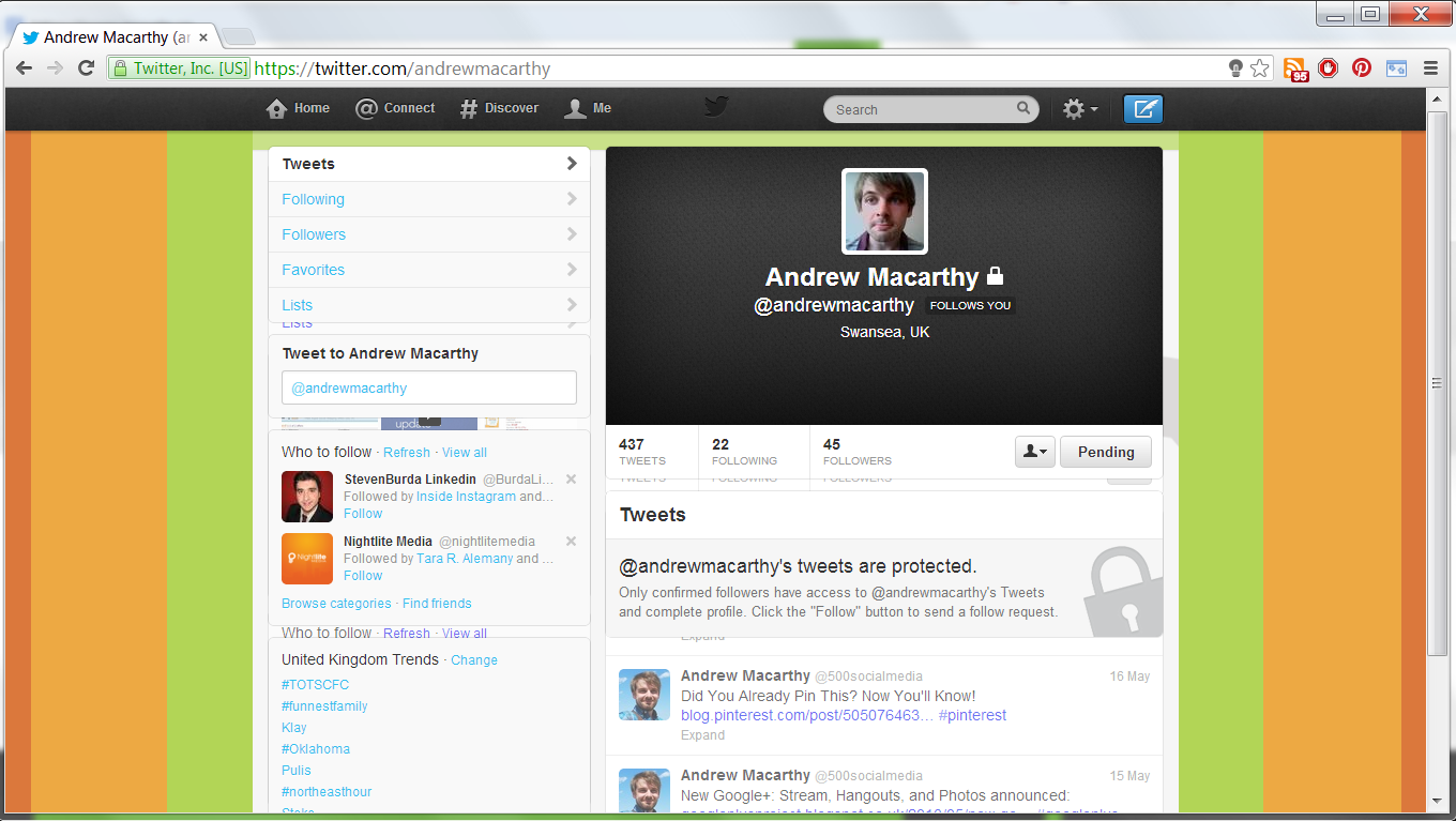
- Design not optimised for largest resolutions, leaving blank areas (see image above).
If you've had any of these problems, my free Twitter background template will help. But, before we get to it, let's take a look at the relationship between Twitter, screen resolutions, and Twitter background designs so that you can use the template as effectively as possible.
Explained: The Anatomy of A Twitter Page
No matter what resolution people view Twitter on their desktop monitor, the news feed - which is always 865 pixels wide - will always sit in the centre of the page. That leaves an equal amount of space either side of it for visible background design (the rest being hidden behind the news feed itself). How much of the design is visible by a user, then, depends on the resolution of their display.
Therefore, in designing your Twitter background, you should aim to cater to as many people using as many different resolutions as possible, especially if you want branding on either side of the feed that isn't just a plain or patterned background (promotions, slogans, product images, etc).
Global Stats For Screen Resolutions
According to the most recent global statistics, the most popular screen resolution for viewing the web is 1366 x 768 pixels (around 24% of the total) followed by 1024 x 768 (around 16%). From these stats (and those for less common sizes), we can deduce that for the vast majority of people viewing your Twitter profile will be able to view a background design optimised for a 1366 x 768 pixel resolution. Anything designed for bigger resolutions will be wasted on the majority of users.
Using the Template to Cater for the Majority
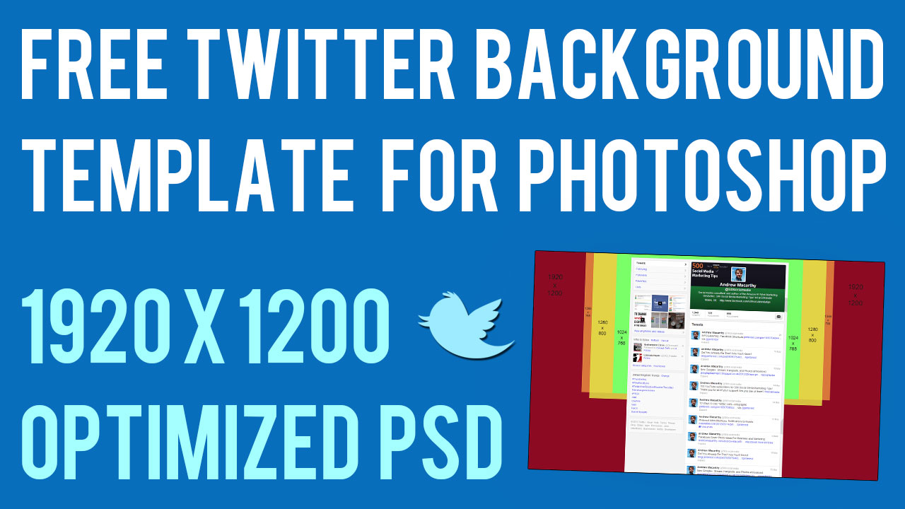
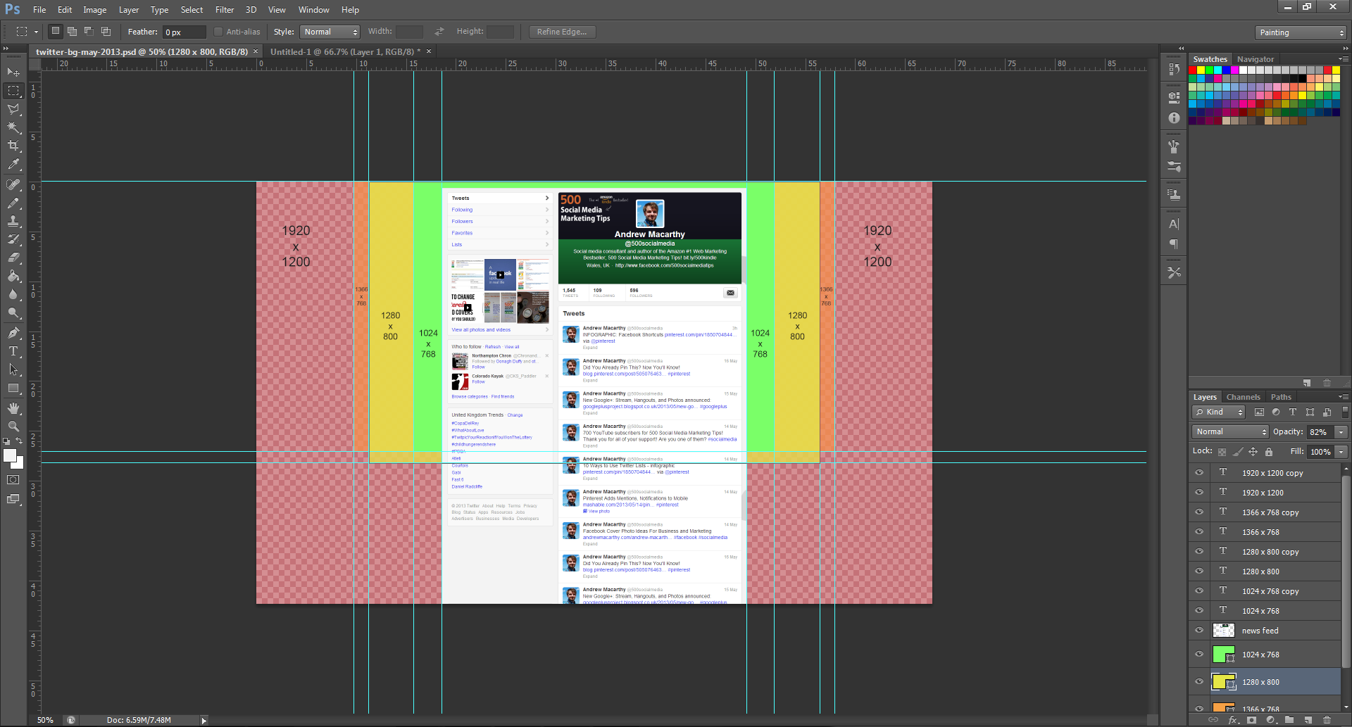
Now, let's look at the template I have designed. For display resolutions of 1024 x 768 pixels, 1280 x 800 pixels, and 1366 x 768 pixels (represented by the green, yellow and orange boxes in the cropped image of the template above), the amount of your background design that will be visible on either side of the news feed is 66 pixels, 194 pixels, and 238 pixels respectively.
Optimising Your Twitter Background Design

The biggest resolution people are likely to view Twitter at is 1920 x 1200 pixels, so the template is offered at this size and I urge you to design with people viewing at this resolution in mind, but optimised for the majority who only see up to 1366 x 768 pixels, i.e. when using the template, put your most important branding elements - logo, products, offers, URLs within the orange box. View the gallery above for examples of how the Twitter background will appear for users at different resolutions.
Of course, while 1366 x 758 is the most popular screen resolution for now, this is likely to change in future and so you may want to change your Twitter template with it.
How to Use the Twitter Background Template
When you open up the Twitter Background template in Photoshop or GIMP, it will look like the image above. Work above and/or hide the layers representing the Twitter news feed and screen resolutions, then remove them all before saving your design as a PNG before uploading it to Twitter. Remember to work using the whole space, but optimize your design for 1366 x 758 pixel resolutions.
Note: The Twitter navigation bar does not appear in the template. This sits above your background when it is uploaded, not on top of it. And while every effort has been taken to make this template as accurate as possible, prepare yourself for minor tweaking of your background design elements if necessary. Test and tweak is the name of the game!
One Last Thing - Centre Your Background!
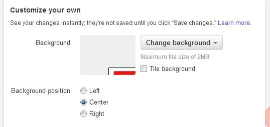
Twitter backgrounds are left-aligned by default, but this template is designed for optimal viewing on all resolutions when the background is centred, so make sure to switch to this option when you upload, as shown above.
Download the Twitter Background Template
This Twitter template (and several others for all the biggest social networks - expertly measured, simple to use, and up-to-date) is available instantly as a downloadable zip file via the purchase link above. For more information on all my social media templates, click here.
Note: Payment is fast and secure via PayPal, but you do not need a PayPal account to buy and download. it!
ABOUT THE AUTHOR
Buy 500 Social Media Marketing Tips (Kindle or Paperback)
Amazon US: http://www.amazon.com/dp/B007L50HE6
Amazon UK: http://www.amazon.co.uk/dp/B007L50HE6
Follow Me:
http://www.facebook.com/500socialmediatips/
https://pinterest.com/500socialmedia/
http://www.twitter.com/500socialmedia
http://www.youtube.com/500socialmediatips


