3 Ways to Use Twitter Feed Image and Vine Previews For Business
/In late October, 2013, Twitter rolled out an update to its desktop site and mobile apps that changes how images (specifically those that are uploaded to the site directly) and Vine videos are displayed to users in their feeds. Let's take a look at the changes in detail and how you can use them for marketing purposes.
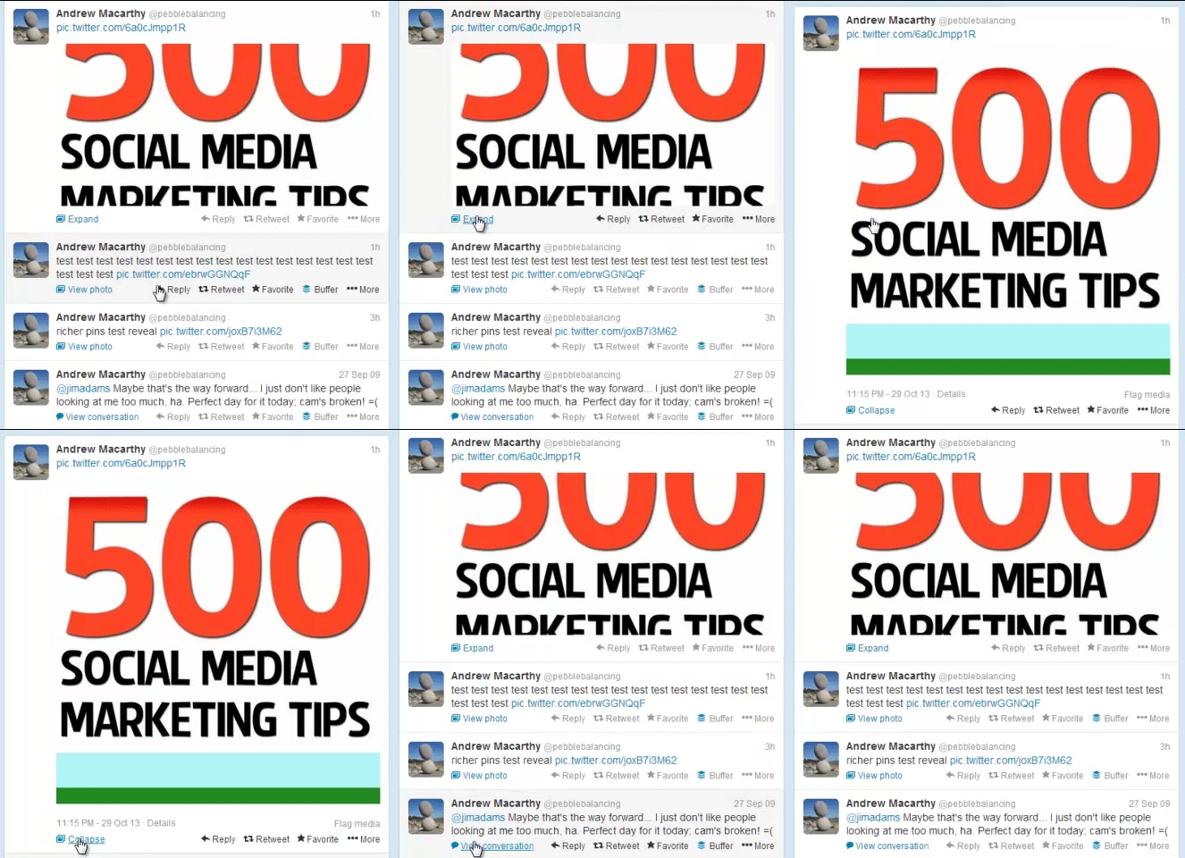
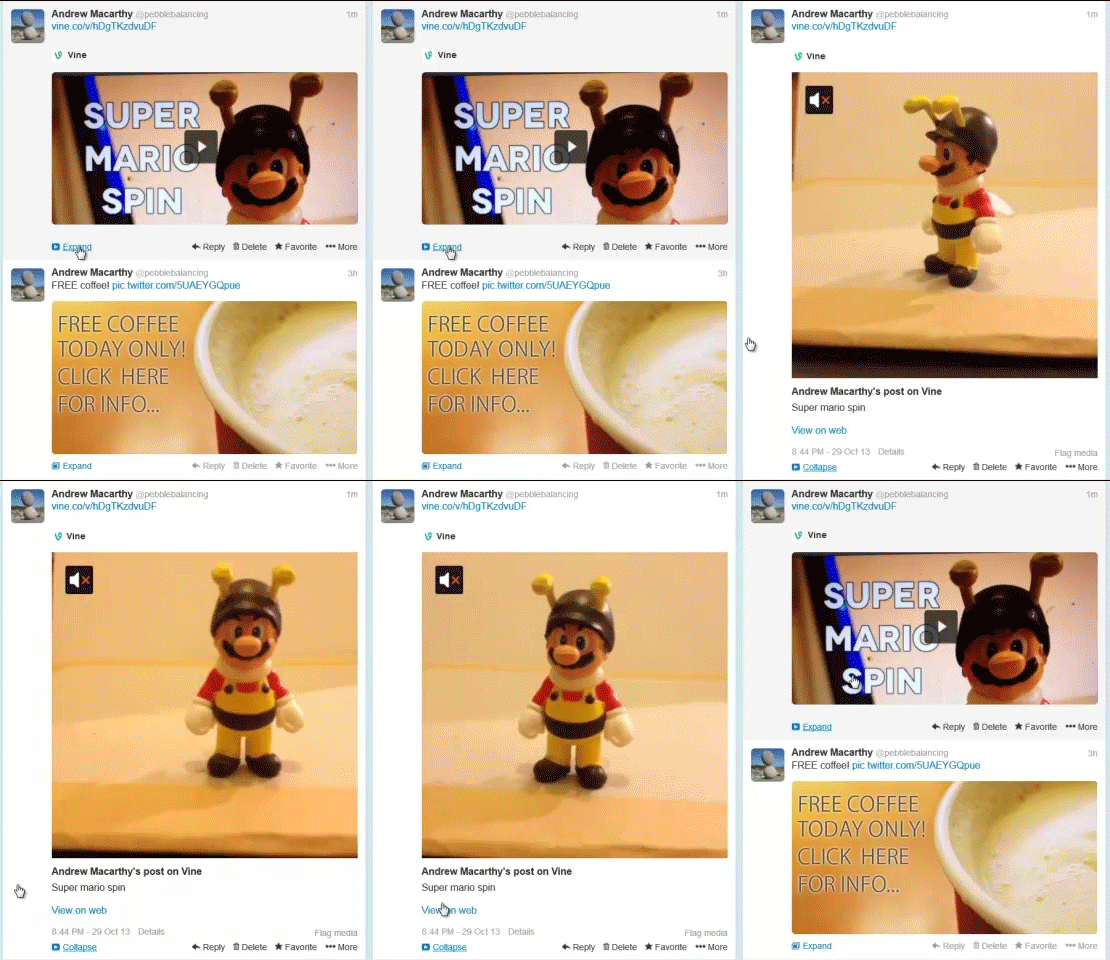
In the past, images and Vine videos posted to Twitter would appear as a link in a tweet, and be completely hidden. To see the image or video, a user had to click on a link and the photo or video would unveil itself within the feed, as shown above.
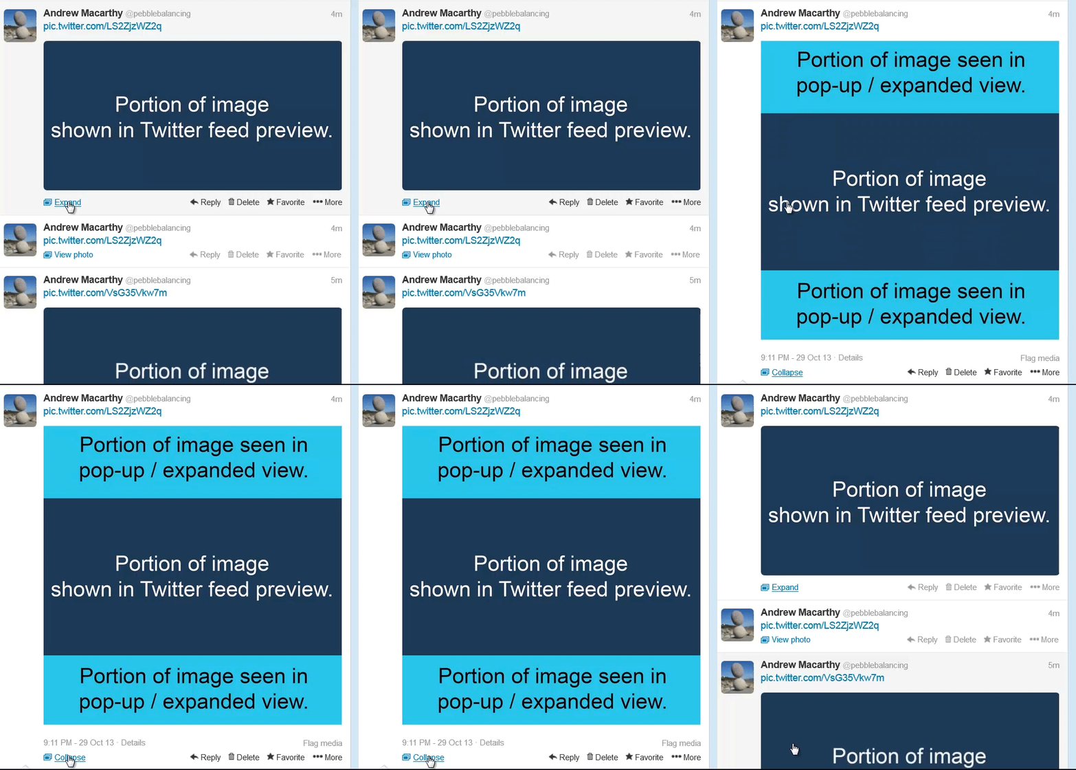
Following the update, a portion of the uploaded image or Vine video is visible in the feed. Users can either click on the media to see it in a pop-up window, or click the Expand link, upon which the full image or video will be unveiled, as above.
This new way of displaying images on Twitter makes the social network more visual than ever before, and also opens up new ways for brands to highlight their wares. Here are three approaches you can take:
Promote events and sales
img: Kris Krug
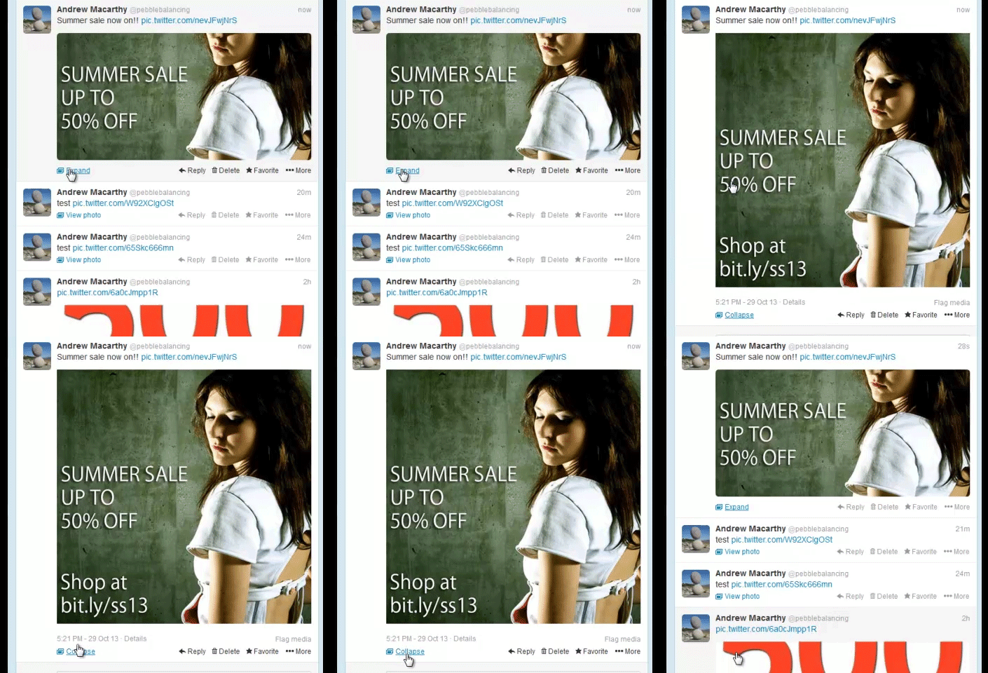
Use the portion of the Twitter image that displays to promote a product or event. Nice and simple.
Reveal an offer
img: Lali Masriera
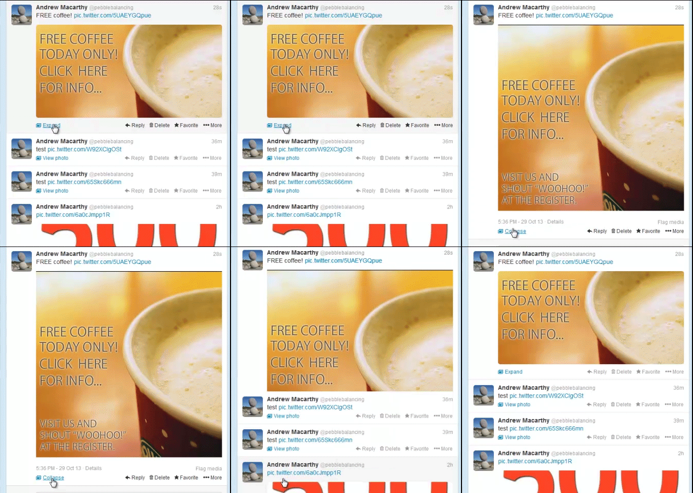
For a bit more mystery and excitement, create an image for Twitter that can only be revealed if a user clicks or expands your photo.
Give Vine videos a cover photo
When a Vine video is posted to Twitter, the recording's first frame becomes the preview that users see in the feed. To compel more people to click on it and watch, plan your shoot so that the first recorded frame is what you want the cover photo to be, whether it's simply the title of your video as above, or a still shot of the drama within.
Twitter feed image positioning
The way that Twitter's image and Vine video previews are displayed in the feed means that you will have to plan ahead if you want your message to show exactly as you want, without it being cropped and hidden.
When you upload a still image as a square - I recommend this as it is the shape most commonly used on many social networks - the centre third of the image is what will appear in the preview window on Twitter, while the remaining top and bottom portions are revealed when the image is expanded. Therefore, aim to keep your most important message in the middle block of space.
Vine videos act a little differently. When posted and viewed on desktops, the top half of the first frame of the video shows in the preview window, and the bottom half is revealed when the media is expanded. On mobiles, Vine videos act likes images - the centre third of the preview image is shown.
Conclusion and template
I hope this post has given you some inspiration for how you might take advantage of Twitter's new previews for images and Vine videos. If you are interested in making the job super easy, you can grab the template I have created for designing Twitter images with messages that fit perfectly within the preview window (along with numerous others) over on my Social Media Templates page.
Buy 500 Social Media Marketing Tips
Amazon US: http://www.amazon.com/dp/B007L50HE6
Amazon UK: http://www.amazon.co.uk/dp/B007L50HE6
Follow Me:
http://www.facebook.com/500socialmediatips/
http://www.pinterest.com/andrewmacarthy
http://www.twitter.com/andrewmacarthy
http://www.youtube.com/500socialmediatips


